Posts Tagged ‘color’

Nam Nguyen Hair and Makeup

Studio Shoot

Having talented friends is a blessing! This shoot was for Nam Nguyen, hair and makeup artist in northern Virginia. Previously, I knew Nam for his fashion expertise. He worked for a client of mine as the inventory manager and stylist for a ballroom dress company. While I was there for photo shoots, I was impressed with his talent. Not only did he excel in styling dresses for imaging on the website, but he was great with customers. Being that dancers will be performing in front of large crowds, they want to look their best. If Nam approved of your look, you would be ready for the judges!

On this occasion, Nam had some ideas for a stylized shoot. Since his days at the dress company, he studied hair styling. When I heard that was his plan, I knew he would be successful. Together with his overall fashion aesthetic, I knew he would be a sought-after stylist. We collaborated on a few photo shoots over the years, and I enjoyed having these images in my portfolio.

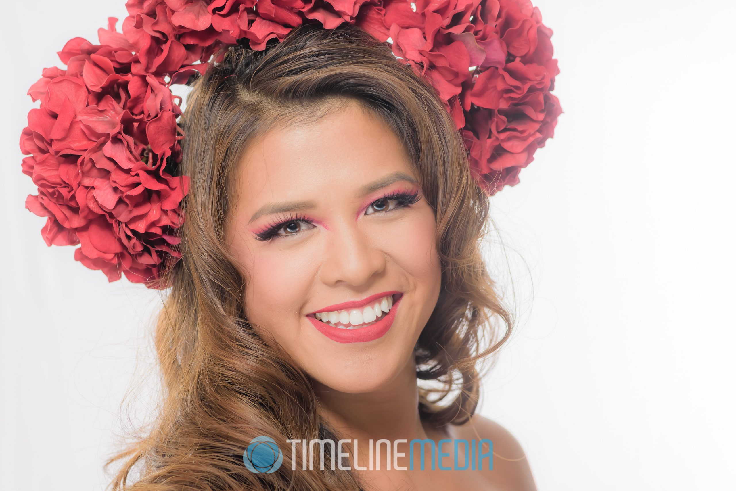
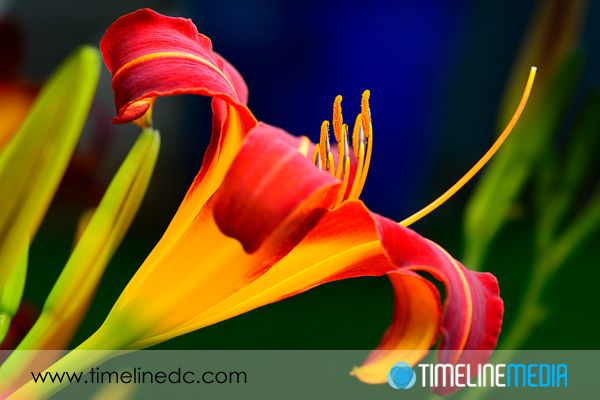
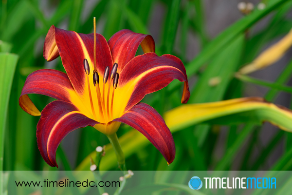
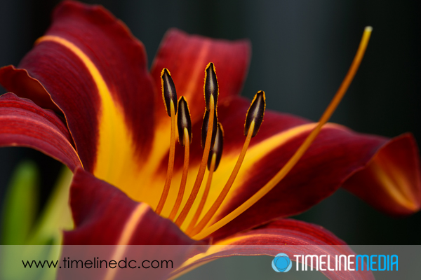
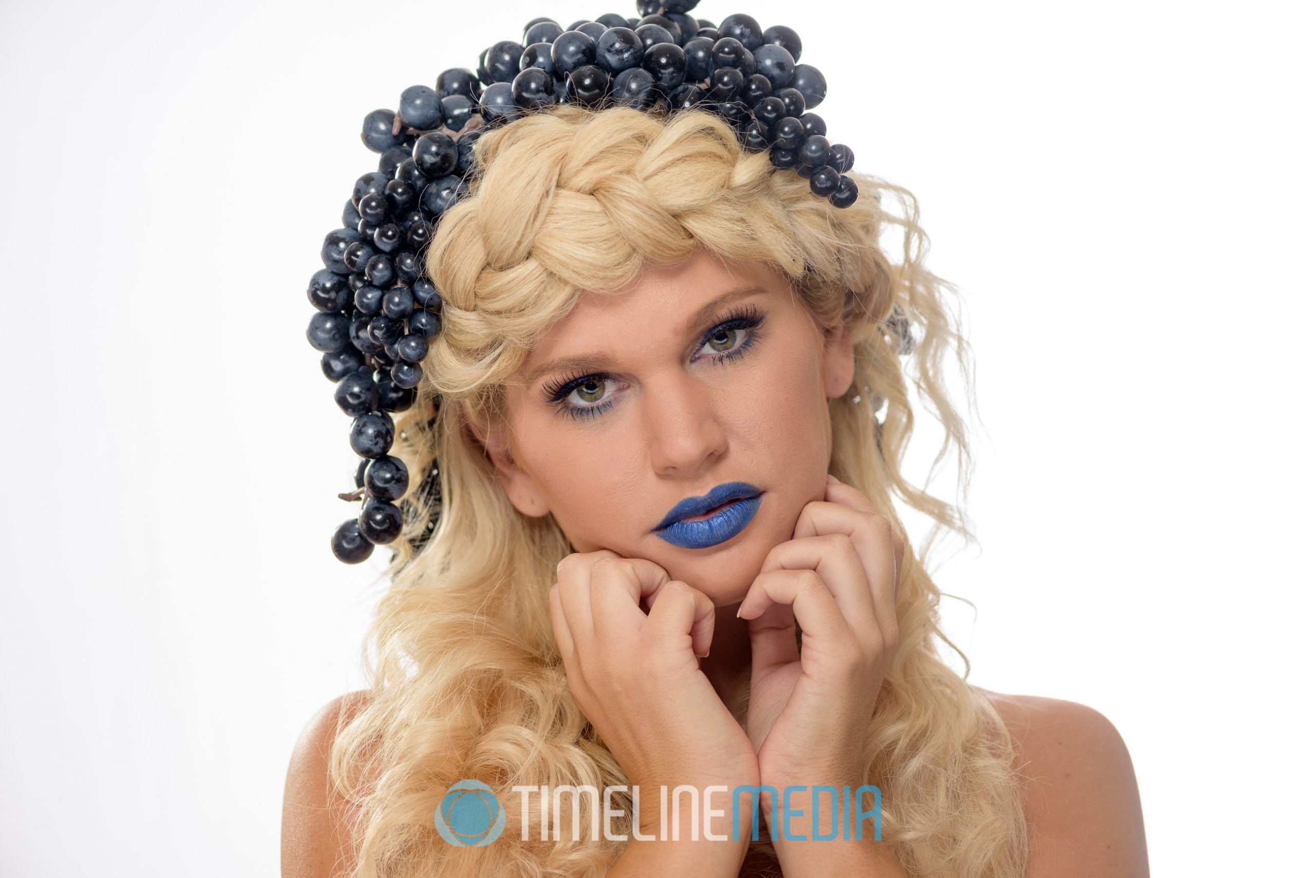
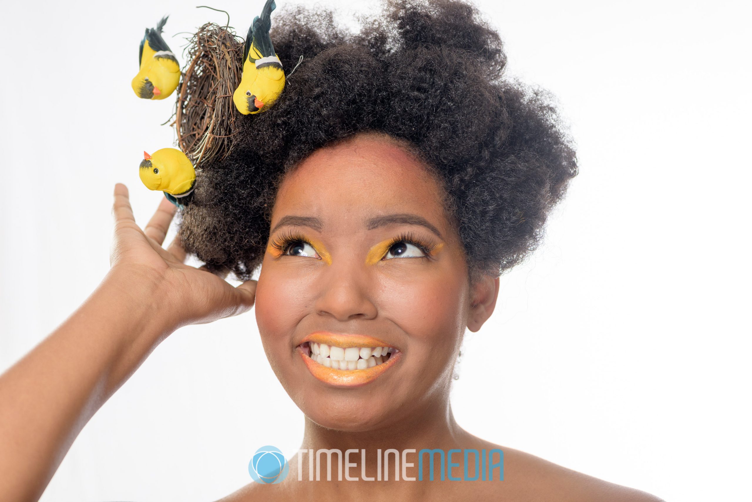
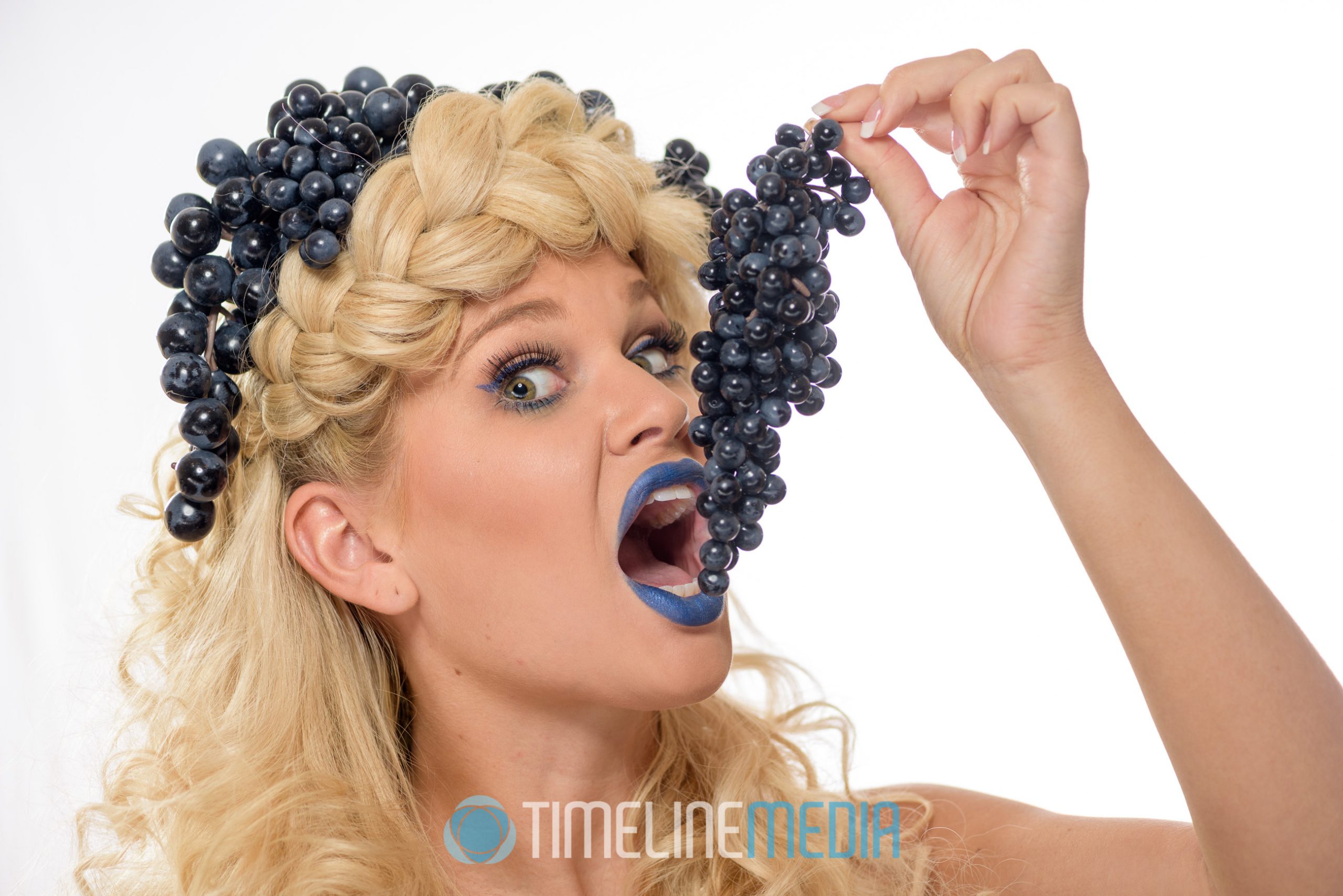
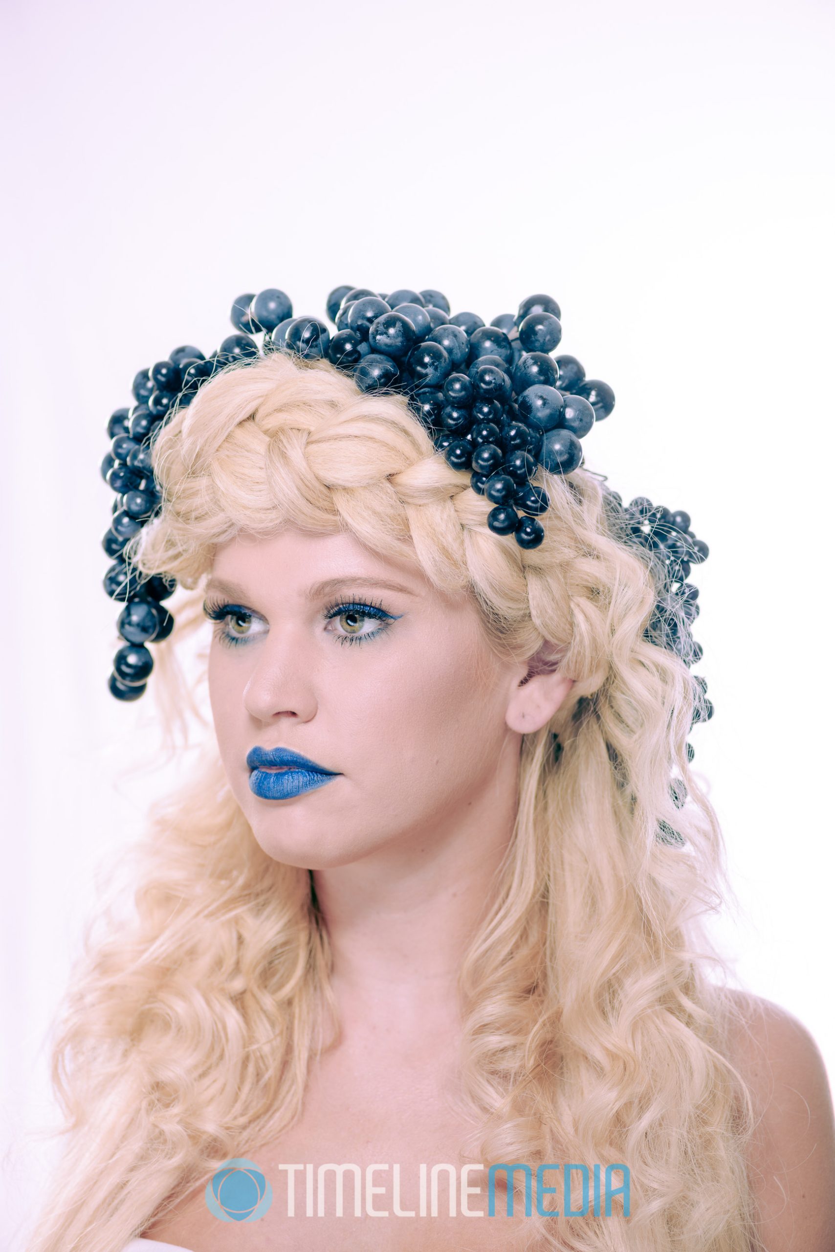
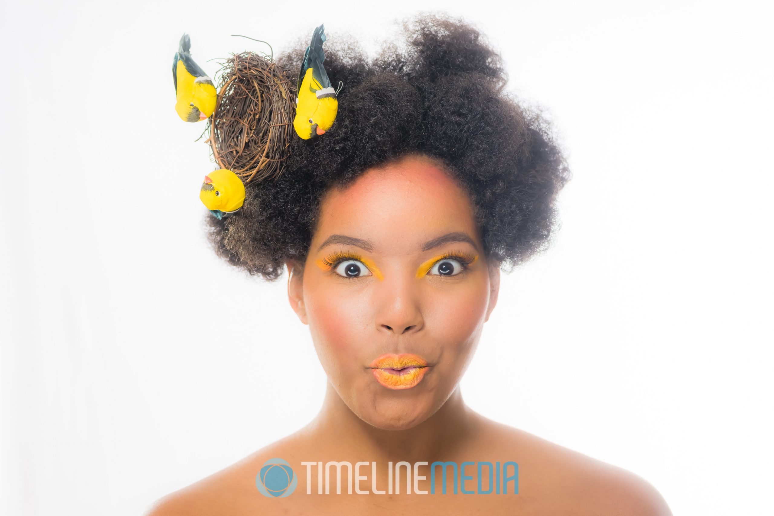
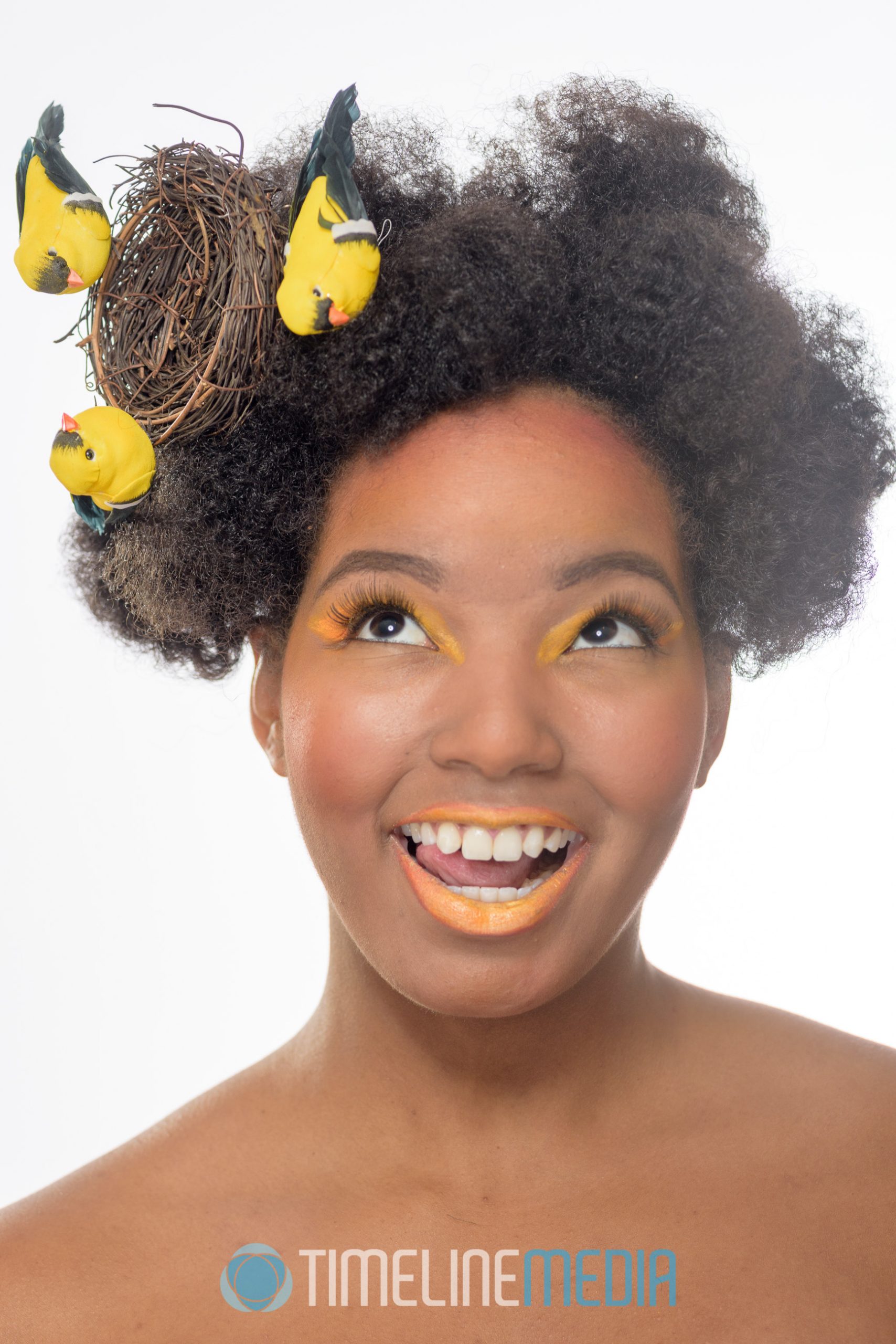
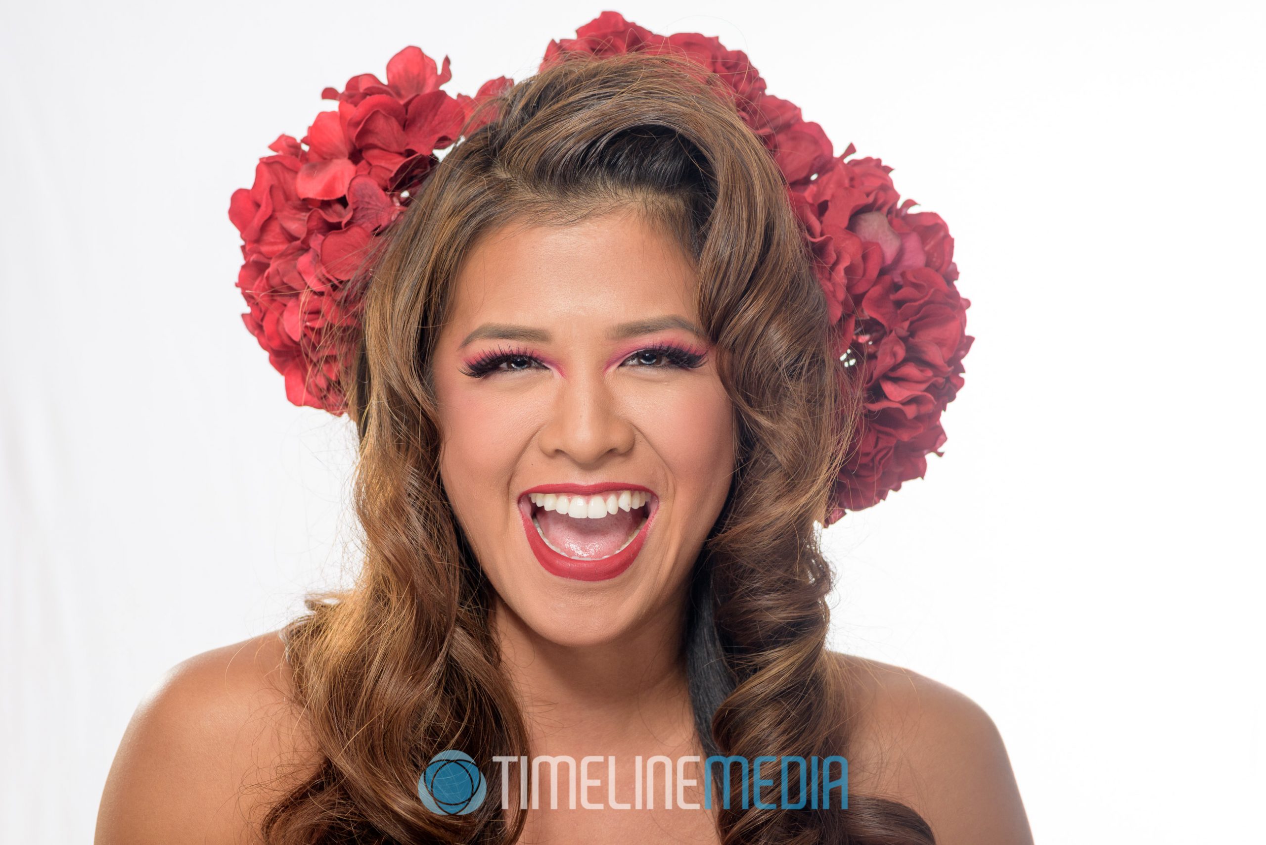
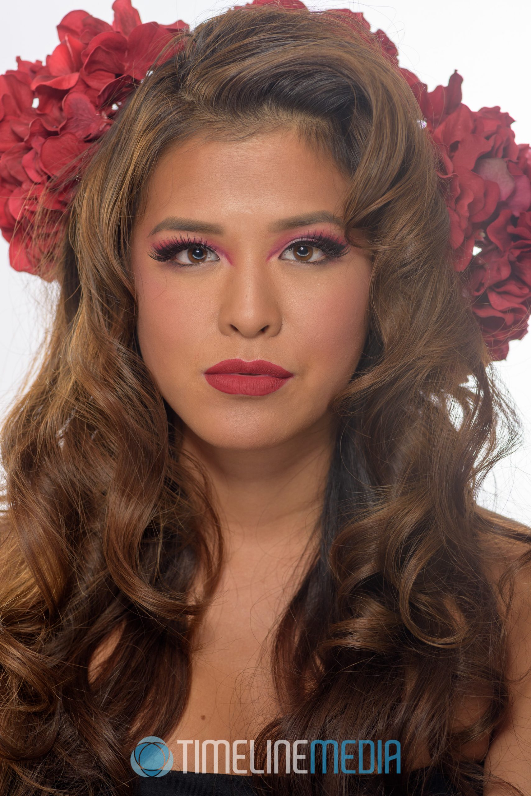
These models offered to help him create marketing materials for his hair and makeup services. Of course the hair would be done nicely for the camera. Then, the makeup would color match extra props that would be added to the hair. In particular, blue makeup with grapes, yellow-orange makeup with yellow birds, and red makeup with hydrangea flowers.

For this purpose, I setup a plain white backdrop. Along with the Eyelighter to make the eyes pop, a large softbox created a soft light on their faces. The lighting worked with this setup for all three of the models. Given that the photos were sent right to a large TV for review, we hit the goals of what Nam was looking for! I wish him the best of luck with his growing business!

Nam Nguyen Hair and Makeup

TimeLine Media – www.timelinedc.com
703-864-8208

Concert Lighting White Balance | Tech Tuesday

Theatrical lighting for stage performances adds to the spectacle of musical performances. In the times I have covered musical groups as they performed, I have enjoyed using the additional lights around the stage as cool props that can add to the images. The lights at SingStrong were especially timed with the performance which enhanced the mood of the performances. They can be challenge to get good focus as the darkened arena against the strong point light sources is not ideal for auto focus systems in cameras. There are a lot of missed shots in the collection!

SingStrong-2014-©TimeLine-Media


The other challenge comes in post processing the images after the concert. The lighting can be very strong in color casts. Whether that comes from gels over lights, or LEDs that can be any color, they will cast strong color. Of course, this color will be over their faces and skin tones which is always a challenge to balance afterwards. For this shoot, I had the white balance set to auto. Because I was shooting raw files, I planned to adjust the settings later in post.

Original-balance-out-of-camera-©TimeLine-Media


The lighting in the photo was a strong blue backlight that you can see on the left of the frame. From the front house lights, there was a red light on the front of the performers which is a common combination in stage lighting. To balance the color in Lightroom, I went into the Develop module, selected the White Balance tool, and then placed a point on the gray head of the microphone. I always look for gray colors for balancing as a starting point, and it worked well in this case toning down the pink skin tones.

Color-corrected-©TimeLine-Media


I have much better luck going for gray tones in the frame. Sometimes there is not enough data in white or black areas to get an accurate white balance setting. The software may tell you, however, it will not change anything in your photo depending on the image. Of course, it is always important to have a calibrated monitor to ensure consistency in printing images. If the color cast is too strong, removing all color from the photo is also an option, and one I go to frequently!

Monochrome-conversion-©TimeLine-Media

TimeLine Media – www.timelinedc.com
703-864-8208

Color – Tech Thursday

©TimeLine Media - Day Lilies

My photography has been primarily been in color. Ballroom dancers especially, love to show off their dresses and costumes in the vibrant hues with which they were made. In photography classes, I was first introduced to the color wheel and how the information it contains can help photography composition.

Color Wheel
Color Wheel

Color Theory

Examining the color wheel, you can see where lots of branding and logos get their colors. Complimentary colors lie across the color wheel from each other – red and green, or purple and yellow for example. Analogous colors are adjacent to each other on the wheel such as red and orange or blue and purple. This is another added element of creativity you can use in photography. As an example, here is another flower shoot that had some challenges.

This day lily has some beautiful color – newly bloomed, and early in the morning when the sun is lower in the sky, and not too harsh. It helps to keep the photographer cool too! So here is the first photo showing the flower with all the background elements surrounding the plot where they are planted.

©TimeLine Media - Day Lilies
©TimeLine Media – Day Lilies

A nice snap, but I don’t like a few things in this frame. There is an older lily that does not open any longer in the right side background of the frame. Then in the far back of the frame is a brown/gray area of the fence that was immediately behind the flowers. The first change I made was how close I was to the subject. Using a macro lens, you can get very close which easily eliminates some of these problems.

©TimeLine Media - Day Lilies
©TimeLine Media – Day Lilies

Adding flash to the photo also let me darken the background more than the first photo. This helps to take the fence out of the frame even more. The final change that I made was to use color to make a more pleasing background. Here is where card stock and a holder of some kind could help, but I did not have any of that available. So, I moved a large recycling bin into the background! It is a large, BLUE, plastic can that was easily maneuverable. On the color wheel, the reds/oranges are across from the blue range, so I thought it would be worth a shot.

I am happy with the results! It is subtle, but it added to the saturated look of the entire image. Try a color wheel experiment the next time you are shooting flowers, product shots, or fashion. The information from the color wheel can add to your creativity.

©TimeLine Media - Day Lilies
©TimeLine Media – Day Lilies

TimeLine Media – www.timelinedc.com
703-864-8208

1 2 3