Posts Tagged ‘composition’

New Camera – Rule of Thirds

Rule of Thirds - ©TimeLine Media

Composition Rules

Have you taken a few hundred photos with your new camera yet? Well it has been almost three days since Christmas – what are you waiting for? Keep taking all the photos you can with it to get more comfortable with how it works. You want to be able to pick it up and have it fire off a photograph quickly so you do not miss anything unexpected that may come along. But as you it becomes apparent that everything works, you may start think how to make your photos better. I still would not even change any of the settings on the camera. I would first concentrate on composition. This is something I have to do at every shoot, and it changes with each subject, each scenario, and each scene. No matter how good you are technically at making photographs, if the composition of the image is poor, then you do not have an image that you will like, or that other people will want to view and share.

Restaurant portrait - ©TimeLine Media
Restaurant portrait – ©TimeLine Media

Rule of Thirds

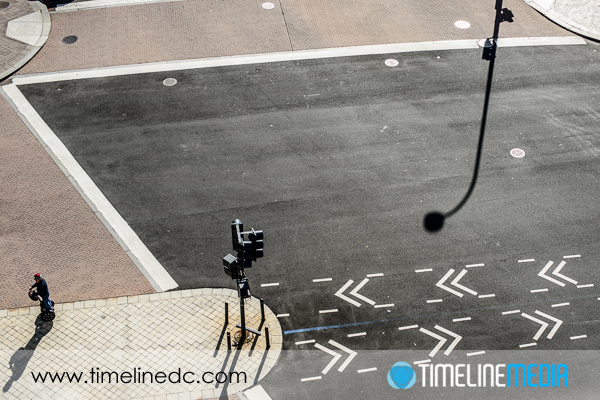
One of the first composition rules that photography students study is the “Rule of Thirds”. Using the viewfinder camera as your boundary, divide the frame into 3 parts both horizontally and vertically. You end up with a grid that looks like this:

Rule of Thirds grid on a 4x6 frame
Rule of Thirds grid on a 4×6 frame

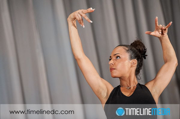
According to the Rule of Thirds, objects of interest should be placed along the lines that divide the frame into three parts. This includes horizon lines, faces of people, or other objects of interest. Usually they are the main subject of the photograph. You can see here in this photo that I did not follow this rule, and put my main subject right in the middle of the frame. This is one of the reasons that this photo looks more like a snap shot from vacation rather than a professionally setup image.

Restaurant portrait with grid - ©TimeLine Media
Restaurant portrait with grid – ©TimeLine Media

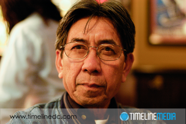
You can see the rule of thirds in many professional photographed still and video images. The news anchors on television may start in the middle of the screen, but they are quickly moved to the left or right third of the screen. This makes for a more pleasing image to the eye – giving the subject more room to breathe in the frame, and more room for your eye to travel in the frame putting your subject in context. These are with people images, but it can work with images of inanimate objects, or in landscape photography as well.

Rule of Thirds - ©TimeLine Media
Rule of Thirds – ©TimeLine Media

TimeLine Media – www.timelinedc.com
703-864-8208

Minimalism

©TimeLine Media - Minimalism - Hirshhorn Museum at night

On this Saturday morning, there is a lot of sad news coming from the Philippines. The record-breaking Typhoon Haiyan hit the island nation very hard. I still have lots of family that lives in the provinces of Leyte and Southern Leyte, and we are hoping for the best as the recovery and rebuilding starts.

For today’s photography post, I wanted to write about minimalism in photography. Just as in writing, painting, or other artistic forms, it is a challenge to strip out the extraneous elements that may not add to the final piece. There is are authors that write six word novels, or poets that only write haiku. It may seem seem restrictive to put limits on how many words or syllables you use in your work, but it also can open up a new world of creativity. The structure is set for you, just finding how you can fit your art into the structure is the goal.

©TimeLine Media - Minimalism - Hirshhorn Museum at night
©TimeLine Media – Minimalism – Hirshhorn Museum at night

There are many photographers that I follow on social networks that are amazing with their minimalist work. Photographing structures, landscapes, even street scenes with a lot of negative space leaving forms and shapes for the viewer to interpret. For me, this makes for stronger photographs that seem easier to remember in your mental library. It something that I will practice and strive to better in my photography. It adds to my portfolio which is full of busy, action-filled, dance photos. Let me know what you think!

©TimeLine Media - Minimalism in photos DC
©TimeLine Media – Minimalism in photos DC
©TimeLine Media - Minimalism - underneath the Woodrow Wilson Bridge
©TimeLine Media – Minimalism – underneath the Woodrow Wilson Bridge

TimeLine Media – www.timelinedc.com
703-864-8208

Dutch Angles – Tech Thursday

©TimeLine Media - Dutch angles in dance photography

This is a controversial subject in photographic circles. “Dutch” angles or shooting with the camera tilted from being straight with the horizon is a popular stylistic choice at this time. In browsing wedding photographer websites, I see the Dutch angles in many photographers that describe their style as photo journalistic. This stems from photographers that were chasing images to make newspaper headlines more loosely composing images just to “get the shot” no matter how straight the composition.

Chasing Photos

If you are chasing a person of interest, or in a war zone, it is understandable that you cannot always carefully line up images due to time constraints, or keeping your body from danger. The first working photographers I was exposed to in my career were wedding photographers. So many of them use this technique as part of their style. They are trying to create a different angle and change how images look especially if they have been made hundreds of times at different weddings in the past. In fact, I saw what they were going for, and I really adopted this as part of my photography.

©TimeLine Media - Dutch angles in wedding photography
©TimeLine Media – Dutch angles in wedding photography

There was a stark change in my view on this practice. When I started to shoot sports photography for a news media wire service, they gave some feedback. All images submitted to them had to have straight angles. If the photo we had of the action was tilted, they asked that it be cropped to a straight angle prior to upload. If not, the image would not be accepted. The reason was that for publication, angles needed to be level with the horizon – tilted angles do not translate to things like covers or spreads that magazines and newspapers publish. In looking at my ballroom dance photos, I was surprised to see how many of my images had the tilted angle!

Dance Photos

©TimeLine Media - Dutch angles in ballroom dance photography
©TimeLine Media – Dutch angles in ballroom dance photography

The first time I looked at these, I thought that the images looked more dynamic. Additionally the angle added to the excitement of the dancing action. Now, I think that these photos make me a little seasick. The walls and floors moving to one side of the image creates tension when being viewed, and not in a good way. So, I no longer intentionally tilt my camera. I try to keep angles as straight as I can. Moreover, I crop them to straight during post production if they are a little off. Let me know your thoughts on this. Do you or do you not shoot with Dutch angles as part of your style?

©TimeLine Media - Dutch angles in dance photography
©TimeLine Media – Dutch angles in dance photography

TimeLine Media – www.timelinedc.com
703-864-8208

1 2 3 4 5