Bethesda, Maryland
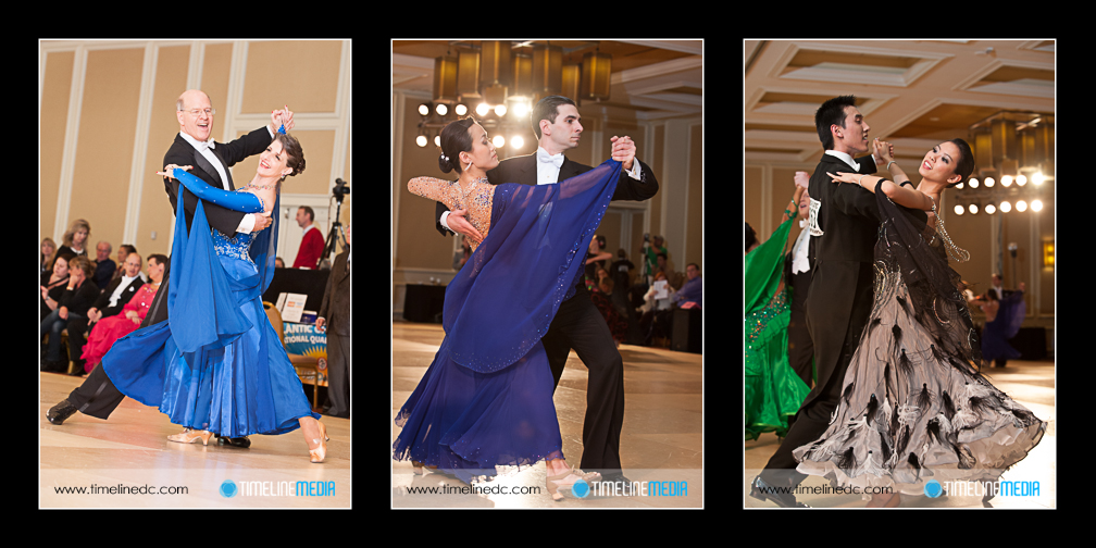
Here is another set of photos from the USA Dance Mid-Atlantic Championships, a National Qualifying Event. The majority of photos that I take at ballroom dance events are in portrait orientation as opposed to landscape. This fills the frame much better with dancers. Landscape photos leave too much of the surrounding background empty unless the floor is very full with other competitors. This does make for some good photos, as that is what I have been posting up until now.
Landscape orientation is the best for web use. In this case you don’t have to scroll your screen to take in the entire photo. This is an idea I have come across while reading some of the best photojournalism blogs on the web. In particular the Big Picture or In Focus come to mind. These blogs keep me riveted in each post from beginning to end. The large presentation, and the beautiful photos keep these on my RSS feed. It is as if you are holding a print in your hand while looking at the computer. It is comparatively closest thing to a daily newspaper I have seen on a tablet.
Photo Collage
For portrait photos, there is a chance that the photos will not fit on one screen. Addtionally scrolling is needed to see the entire picture. This takes away from the experience of seeing the entire frame at once. The alternative is to create smaller versions of the photos. This does work, however, it takes away from the presentation with such a small size. The compromise I will start to use is to make a collage of portrait photos. This will fill the space on the blog. Addtioanlly, it gives the viewers more to look at as they are reading. This post is the first of this type – let me know what you think of the presentation. If you have any other suggestions as to how I can post these, I’d love to hear it!
TimeLine Media – www.timelinedc.com
703-864-8208

