My photography has been primarily been in color. Ballroom dancers especially, love to show off their dresses and costumes in the vibrant hues with which they were made. In photography classes, I was first introduced to the color wheel and how the information it contains can help photography composition.
Color Theory
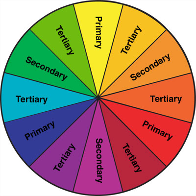
Examining the color wheel, you can see where lots of branding and logos get their colors. Complimentary colors lie across the color wheel from each other – red and green, or purple and yellow for example. Analogous colors are adjacent to each other on the wheel such as red and orange or blue and purple. This is another added element of creativity you can use in photography. As an example, here is another flower shoot that had some challenges.
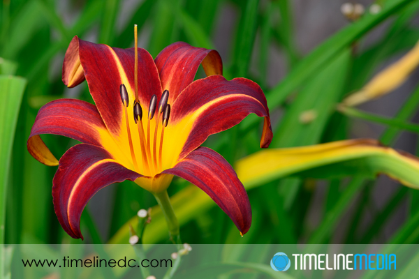
This day lily has some beautiful color – newly bloomed, and early in the morning when the sun is lower in the sky, and not too harsh. It helps to keep the photographer cool too! So here is the first photo showing the flower with all the background elements surrounding the plot where they are planted.
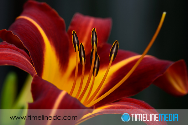
A nice snap, but I don’t like a few things in this frame. There is an older lily that does not open any longer in the right side background of the frame. Then in the far back of the frame is a brown/gray area of the fence that was immediately behind the flowers. The first change I made was how close I was to the subject. Using a macro lens, you can get very close which easily eliminates some of these problems.
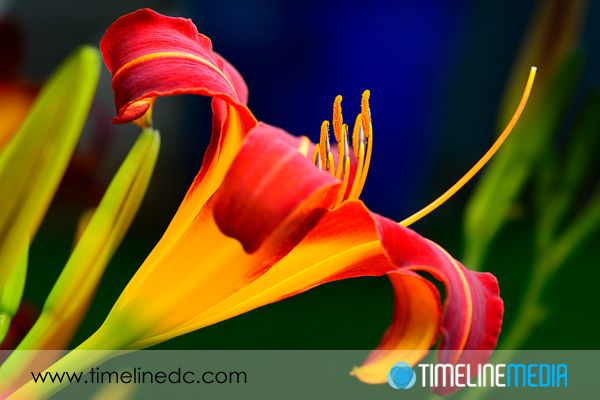
Adding flash to the photo also let me darken the background more than the first photo. This helps to take the fence out of the frame even more. The final change that I made was to use color to make a more pleasing background. Here is where card stock and a holder of some kind could help, but I did not have any of that available. So, I moved a large recycling bin into the background! It is a large, BLUE, plastic can that was easily maneuverable. On the color wheel, the reds/oranges are across from the blue range, so I thought it would be worth a shot.
I am happy with the results! It is subtle, but it added to the saturated look of the entire image. Try a color wheel experiment the next time you are shooting flowers, product shots, or fashion. The information from the color wheel can add to your creativity.
TimeLine Media – www.timelinedc.com
703-864-8208


