Posts Tagged ‘Adobe Photoshop’

Photoshop – the Best Jig Saw Puzzle Solver

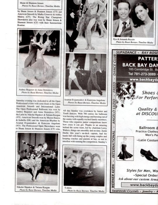
Source image for photo merge

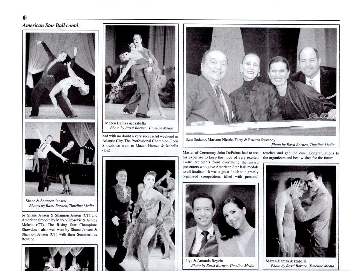
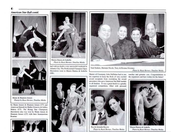
I am working on a personal project to preserve as much of my photo history before everything fades away. My memory will not hold for very long either, I suspect! In some cases, there are some publications where my photos are used, and these larger formats are difficult to preserve digitally. Due to the size of some of these publications, it is not possible to capture the entire spread with one pass of the scanner which is only letter sized. To do this before was a very complicated puzzle-building process. I would have to scan as much of the newspaper-sized pages on the scanner in sections making many different parts that overlapped each other in content. Sometimes, I would have up to 8 different images depending on the size of the print. In this example, I only have 2 separate images:

Source image for photo merge

Photo Merging

Source image for photo merge

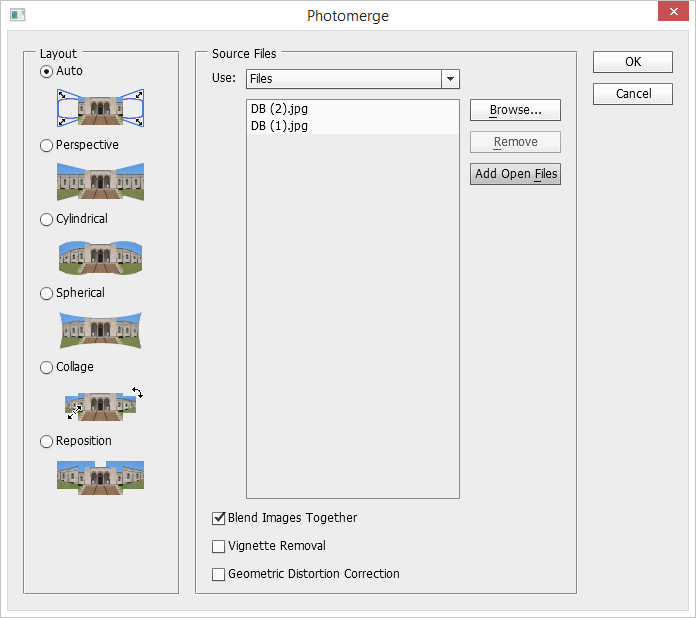
As can be seen in this example all the overlap between the text and the images on the page. In older versions of Photoshop, I would bring in both source images, and lay one on top of the other on a large empty background. Then I would reduce the opacity of the top layer, and maneuver it until the overlapping parts were right over each other on the layer below. It was time consuming, but it was possible. In the newer Photoshop versions, there is a nice automated way of doing this. First, open both images in Photoshop, then click on “File > Automate > Photomerge” which bring up this dialog box:

Photoshop CC Photomerge dialog box

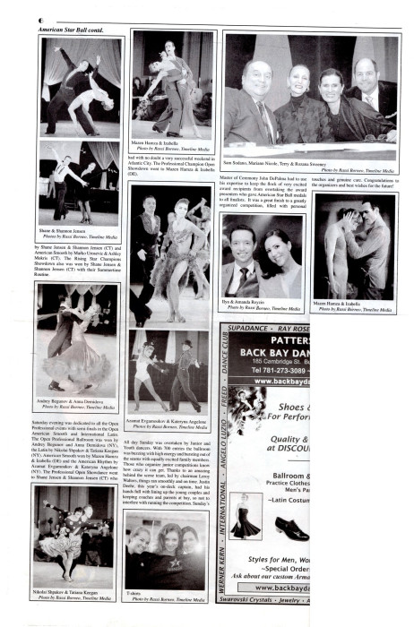
Click the Add Open Files button to add the open images to the process box. Make sure the box – Blend Images Together is selected, then click ‘OK’. Now Photoshop will quickly merge these two images using the overlapping information from each piece to create one large, merged document! This couldn’t be easier. I now only have to make sure that I have lots of overlapping areas from the large print. Knowing that the computer will do all of the aligning, you can scan in as many images as you would like. I have done this with up to 10 different images with no problem.

Large Merged Document

TimeLine Mediawww.timelinedc.com
703-864-8208

Panoramas – Tech Thursday

©TimeLine Media - panoramas from a dSLR

Event Update

Just a quick update on the Paragon Open photos. The editing is completed, and the upload has started at the website. It should not be much longer before they are viewable. The website needs to process the photos – create all the thumbnails for color, black and white previews, and setup all the ordering pages. By this afternoon, all the photos will be available here:

http://proofs.timelinedc.com/

Fall Photography

Around this part of the Mid-Atlantic, the autumn colors are in full swing. It is a beautiful time to drive and walk in wooded areas with the yellows, reds, and oranges on all the trees just before they fall. It is always difficult to determine when would be the best time to go out to take photos. Unfortunately, our busy schedule did not let us go at the optimal time.

©TimeLine Media - panoramas from the iPhone
©TimeLine Media – panoramas from the iPhone

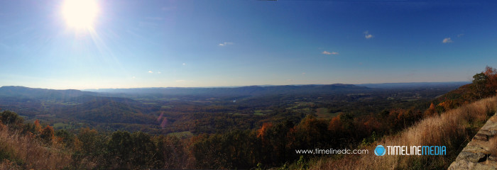
In the photo above, there were still more green than bright fall colors in the leaves. From the overlooks on Skyline Drive, the panorama feature on your smartphone is one of the best ways to capture the grand views on top of the mountains. The biggest challenge for me is to keep the horizon level straight! I had to crop this photo after capture to straighten the view, but my shaky panning also did not keep the mountain level straight through the frame.

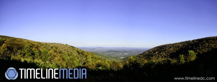
If you have a dSLR with you, the colors will be more saturated, and you can manipulate the RAW files much easier in post. Here is a photo from another overlook made from 3 separate frames. The images were then combined in Adobe Photoshop using the “File: Automate: Photomerge” function. I did not have to input any other information, and the program easily spit out a nice panorama! Having RAW files, you can make sure all the images in your panorama look the same prior to combining them, so it looks like it was snapped in one pull of the shutter.

©TimeLine Media - panoramas from a dSLR
©TimeLine Media – panoramas from a dSLR

TimeLine Media – www.timelinedc.com
703-864-8208

Great Gatsby Poster Part 2 – Tech Thursday

©TimeLine Media - Arthur Murray - Tysons Corner poster

Poster Creation

The last Tech Thursday, I posted about the Great Gatsby poster from the 2013 movie. I made myself a project to recreate the poster with our local dance studio since they are planning a party with a Great Gatsby theme this October. To start, I made portraits of all the staff, then made a background in Adobe Illustrator to place them. It was a background that was flipped and repeated so that it would give a consistent look to each of the portraits.

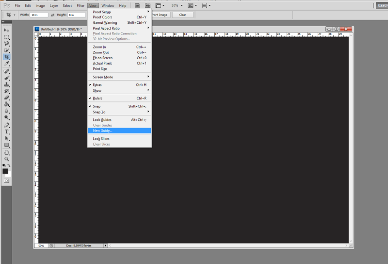
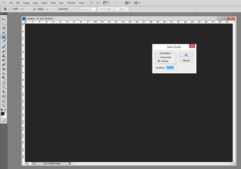
To come up with the dimensions for the backgrounds, I based it on a 20 x 30 image. This is a standard size for printing and framing of photos, and would be large enough to put 7 portraits on at one time. In Adobe Photoshop, you can create guides to help you line up elements in your image. So I started with a 20 x 30 image, then made guides all 14.3% apart from each other. This value comes from dividing 100 by 7, which is 14.28… Rounded to 14.3 would fill up the background close to 100% across – 100.1%, actually. Here are screen shots of how to do this:

New Guide option from the menu in Photoshop CS5

Select ‘View’ > ‘New Guide’ to create a guide on your image. The default units in this box are in inches, so change from in to %, and the guide will be placed 14.3% across the image vertically from the left.

Background Graphic Design

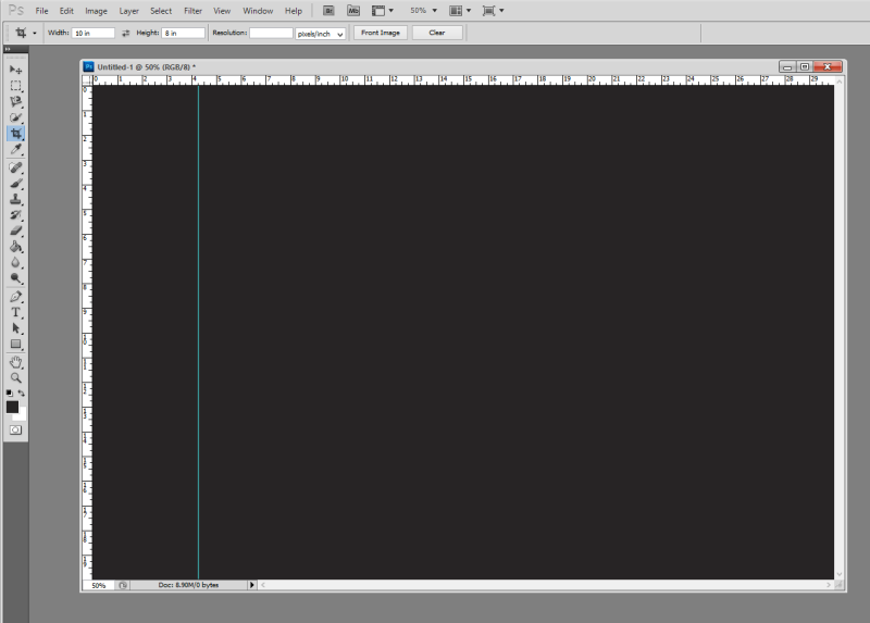
New guide at 14.3% of the background vertically

From here, I just selected the are to the left of the guide to get the dimensions to bring into Illustrator to create the background. Similarly, I made guides in Illustrator that divided the rectangle into quarters. I created the design in one corner, then flipped and moved the design until it filled up the entire area making the design nicely symmtrical:

©TimeLine Media - portrait background
©TimeLine Media – portrait background

I burned some of the smaller lines to make it look like they were continuing on under the larger lines. I also made a dark gradient towards the bottom of the frame to add more dimension to the background. Then I pasted the portraits on top of the background, and added them to the complete poster in my evenly spaced guides. This did take me about a day and a half to complete since I was learning a lot of new techniques in Adobe programs, but I think it came out nicely!

©TimeLine Media - Arthur Murray - Tysons Corner poster
©TimeLine Media – Arthur Murray – Tysons Corner poster

TimeLine Media – www.timelinedc.com
703-864-8208
1 2 3