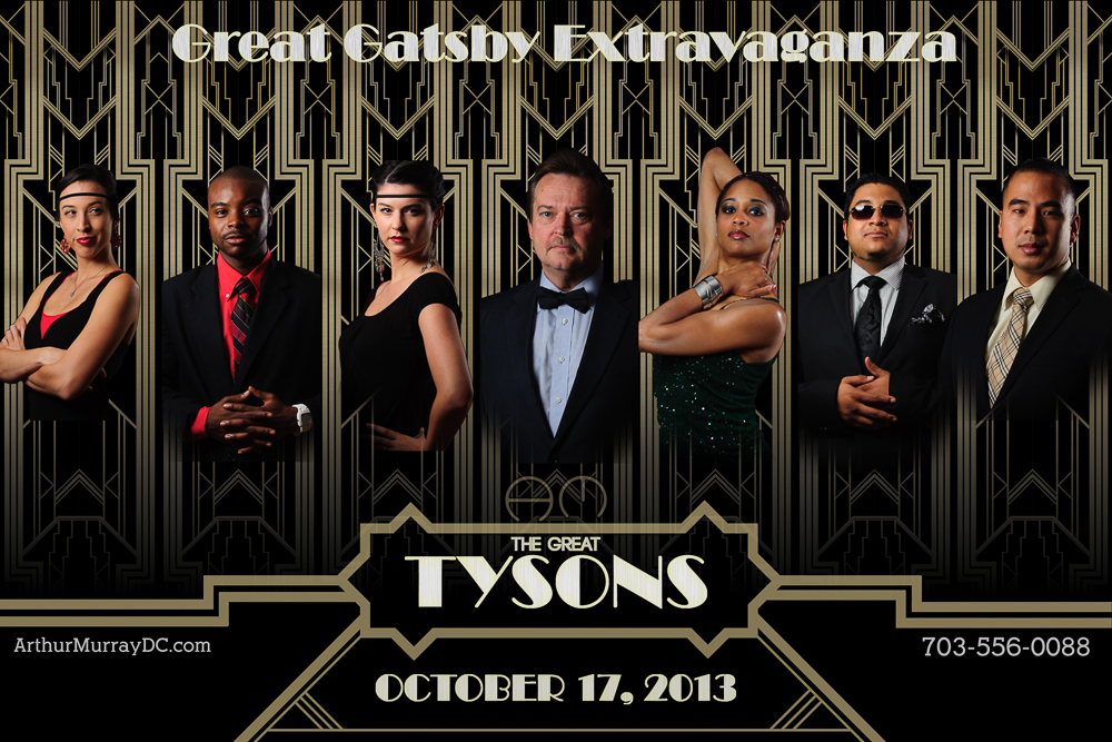
Poster Creation
The last Tech Thursday, I posted about the Great Gatsby poster from the 2013 movie. I made myself a project to recreate the poster with our local dance studio since they are planning a party with a Great Gatsby theme this October. To start, I made portraits of all the staff, then made a background in Adobe Illustrator to place them. It was a background that was flipped and repeated so that it would give a consistent look to each of the portraits.
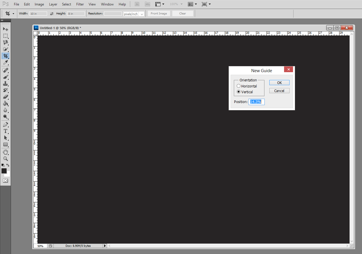
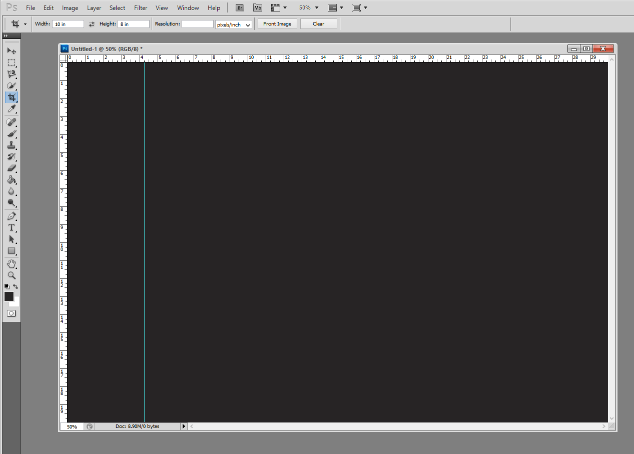
To come up with the dimensions for the backgrounds, I based it on a 20 x 30 image. This is a standard size for printing and framing of photos, and would be large enough to put 7 portraits on at one time. In Adobe Photoshop, you can create guides to help you line up elements in your image. So I started with a 20 x 30 image, then made guides all 14.3% apart from each other. This value comes from dividing 100 by 7, which is 14.28… Rounded to 14.3 would fill up the background close to 100% across – 100.1%, actually. Here are screen shots of how to do this:
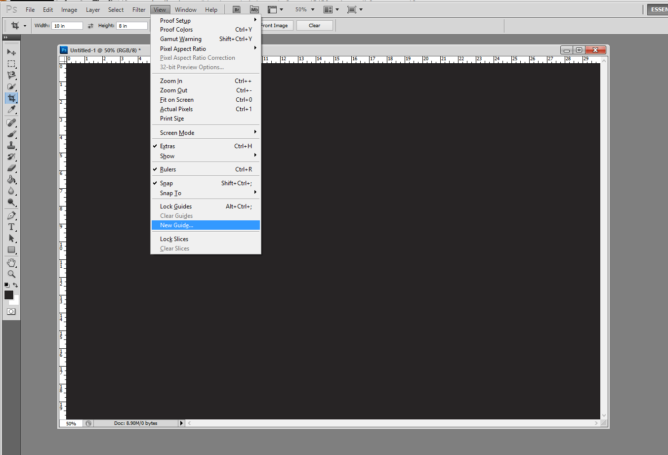
Select ‘View’ > ‘New Guide’ to create a guide on your image. The default units in this box are in inches, so change from in to %, and the guide will be placed 14.3% across the image vertically from the left.
Background Graphic Design
From here, I just selected the are to the left of the guide to get the dimensions to bring into Illustrator to create the background. Similarly, I made guides in Illustrator that divided the rectangle into quarters. I created the design in one corner, then flipped and moved the design until it filled up the entire area making the design nicely symmtrical:

I burned some of the smaller lines to make it look like they were continuing on under the larger lines. I also made a dark gradient towards the bottom of the frame to add more dimension to the background. Then I pasted the portraits on top of the background, and added them to the complete poster in my evenly spaced guides. This did take me about a day and a half to complete since I was learning a lot of new techniques in Adobe programs, but I think it came out nicely!
TimeLine Media – www.timelinedc.com
703-864-8208