Posts Tagged ‘composition’

Compositions with Fog

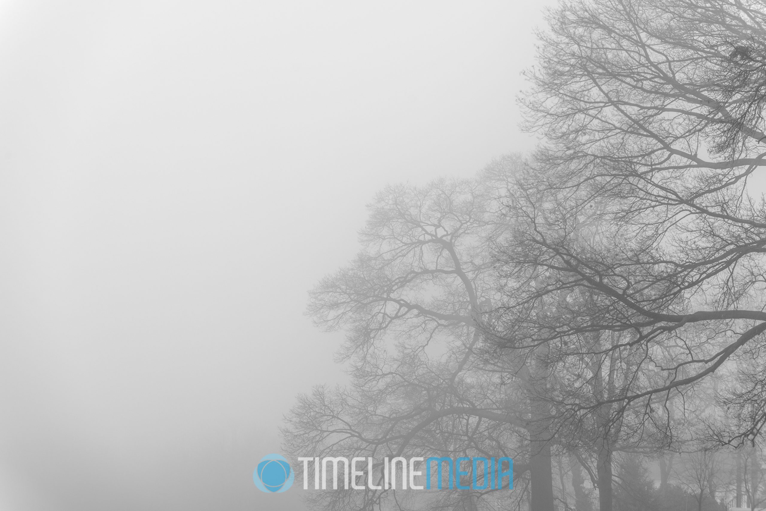
Foggy trees make a minimal composition
Foggy trees make a minimal composition ©TimeLine Media

Virginia

Fog can do a photographer a lot of favors. In our part of the world, it is not a common occurrence for us to have foggy days. So if you are looking to get images of familiar places in a new light, adding a bit of fog can be helpful. Sometimes I come upon a scene, and it is not immediately apparent where I should start. Compositions with fog gets me excited since there is a completely different feel right off the bat. I know from the beginning that I am going to get something out of the ordinary, so my creativity neurons start firing when I start looking through the camera.
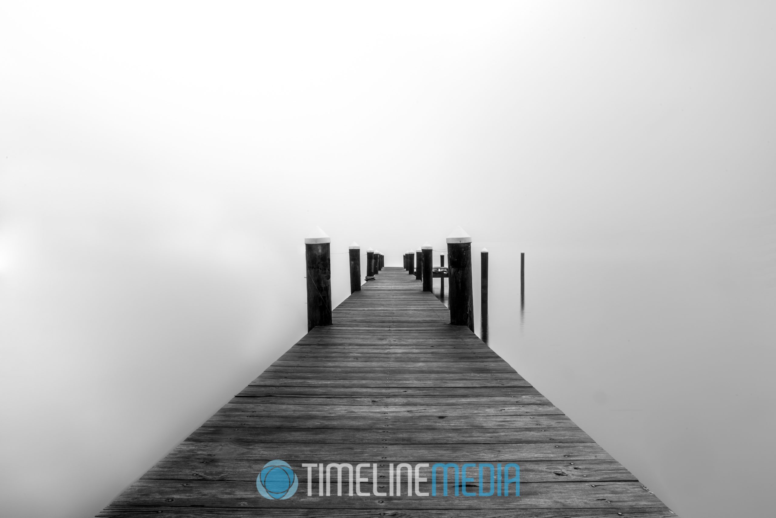
Pier under a cover of fog ©TimeLine Media

Fog acts as a large light diffuser. If there is a sun above it cannot cut through the fog directly affecting your scene. It’s light is spread out across a larger area making the light cast more even. This is the reason why you see studio photographer using large boxes where they place their flashes. A larger light source will make the perceived light softer on your subjects. Fog will automatically do this for landscape scenes.
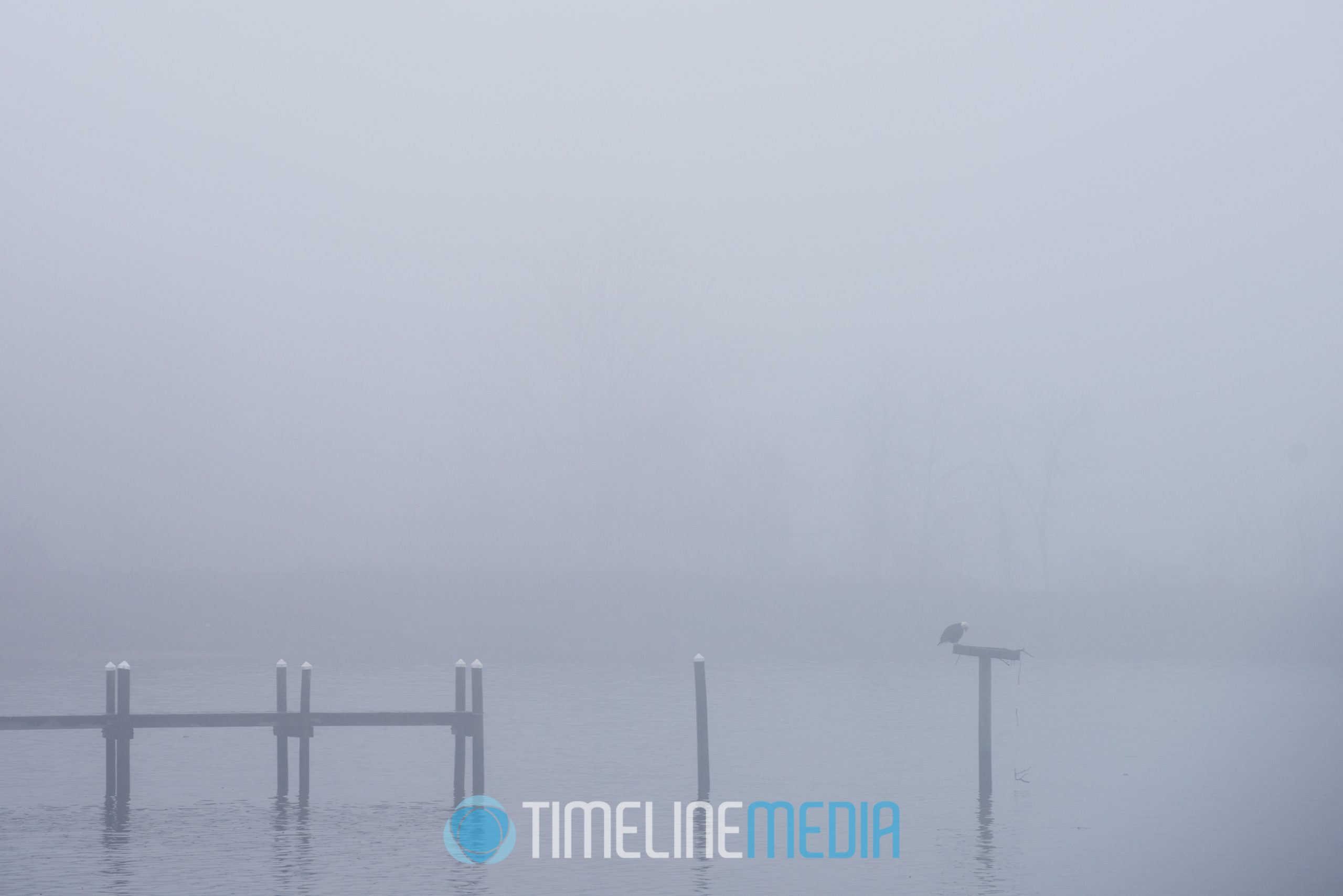
End of pier over a foggy river ©TimeLine Media

Having clear subjects in photos is also a challenge for me. Strong photographs usually have an undeniably clear main subject. With fog it can be easier to isolate a subject for your composition. Clouds in the sky can sometimes make my photos too busy – the fog took care of that problem for me! The stark emptiness adds to the mood while focusing the viewer to what ever is left in the scene. It can give a sense of melancholy, or foreboding, but it does achieve the goal of setting a mood.

Washington, DC

Foggy US Capitol Building and the Capitol Christmas tree ©TimeLine Media

TimeLine Media – www.timelinedc.com
703-864-8208

Analysis Paralysis | Tech Tuesday

Outer Banks North Carolina

Analysis Paralysis will sometimes stall a creative process. It has been a while since I have posted! We have been busy with a lot of events, and we even took some time to go on some trips all around the country. I am back and finally getting some time to go through the photos. While going through the photos, I recall a question that my cousin asked as we were walking around his city. He asked – how do you find better landscape compositions?

Cape Hatteras Lighthouse - ©TimeLine Media
Cape Hatteras Lighthouse – ©TimeLine Media

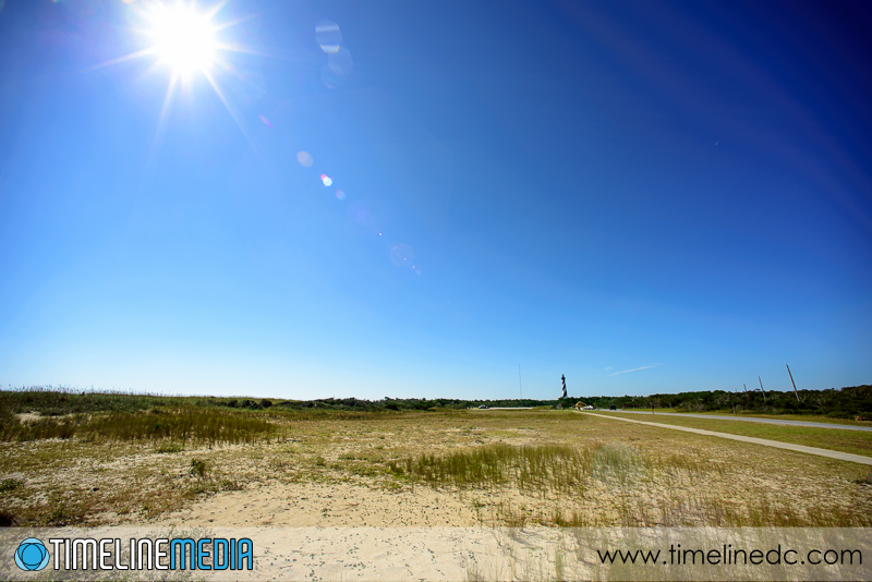
I believe it is a combination of just shooting, and refining. Trying to overthink a photo when you arrive to a location can really take away from your enjoyment of your visit. Also, it may prevent you from getting any images at all! If it is a popular tourist, or familiar landmark like these North Carolina coastal lighthouses, you have a lot of images in your mind already. I always take these classic or overdone photos if I can to add them to my personal collection. But then, I use the digital tools, the back of the camera to review and get a better images before I leave the location. Here we found a nice dune overlooking the Cape Hatteras Lighthouse. My first thought was to use my ultra wide lens to get a lot of the sky with the lighthouse in the far background.

Cape Hatteras through wide angle lens - ©TimeLine Media
Cape Hatteras through wide angle lens – ©TimeLine Media

Working a Scene

Not good. You can’t even see the lighthouse and the frame is dominated by large areas of sand and coastal grasses. I did not see anything that was worth trying again, so I changed lenses. I wanted to bring the lighthouse to a more prominent part of the frame, so I put the 105mm lens onto the camera.

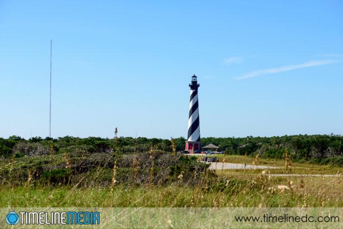
Cape Hatteras Lighthouse - ©TimeLine Media
Cape Hatteras Lighthouse – ©TimeLine Media


This is better. The lighthouse is larger in the frame, but I now see new distractions. There is a paved parking lot for visitors, and a radio tower both of which I did not even see in the first attempt. At least I solved how I wanted the lighthouse to look in the frame. Now I just needed to move my position slightly to move the distractions out of the frame.

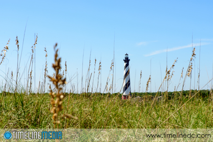
Cape Hatteras Lighthouse - ©TimeLine Media
Cape Hatteras Lighthouse – ©TimeLine Media


Crouching in between the coastal grasses gave me this frame. Most of the distractions are out of the way. I like how the out of focus coastal grasses are leading your eyes to the lighthouse that is rendered sharply. But a few of the tips are a little too large, so they can take the attention away.

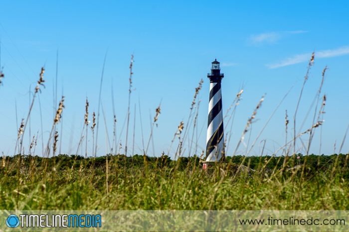
Cape Hatteras Lighthouse - ©TimeLine Media
Cape Hatteras Lighthouse – ©TimeLine Media


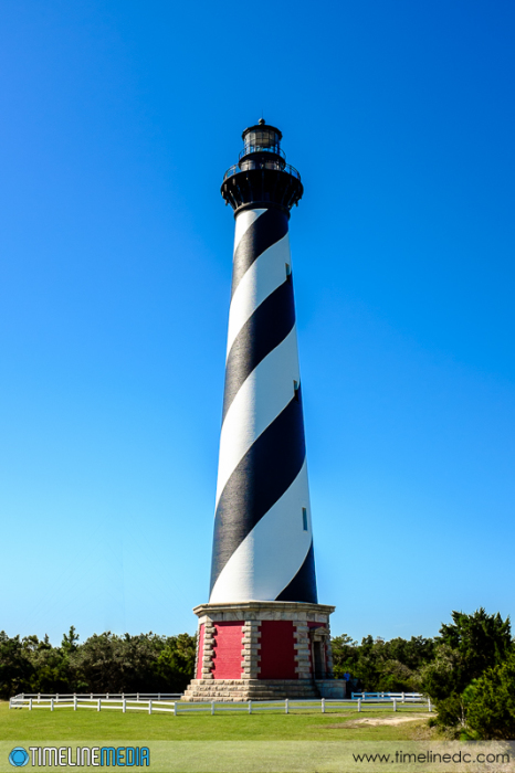
Just moving a few feet allowed me to find my final position. Nothing is blocking the body of lighthouse, and all the grasses are a consistently small size in the photo. I did have to crop a little from the left to completely get rid of the radio tower, but I am happy how this turned out. I really enjoyed making this image, but spent a lot of the rest of the day painfully picking out “hithchikers” that grabbed onto my sneakers.

TimeLine Media – www.timelinedc.com
703-864-8208
Rule of Thirds – Part 2

A cappella singer performing - ©TimeLine Media

We just watched the new motion picture, “American Hustle” which was a movie heavily focused on character development, and character interaction. In movies, the examples of the rule of thirds is used during scenes of dialog, and other half or close up shots of the actor’s faces. When there is only one face on the screen at a time, the extra space that the other third of the frame gives the audience a space to place themselves, or to place the other character that is not on screen.

Having this space really places you in the scene making the viewer more engaged in the film. If this space was not there, it will be jarring to viewers, and will create a tension – like something is not right. This can be used as a compositional element too whether in still or motion pictures. In these photos, the subject is placed on a third, looking through the long side of the frame.

Event Photography

A cappella singer performing - ©TimeLine Media
A cappella singer performing – ©TimeLine Media
Salsa Bachata Throwdown - ©TimeLine Media
Salsa Bachata Throwdown – ©TimeLine Media

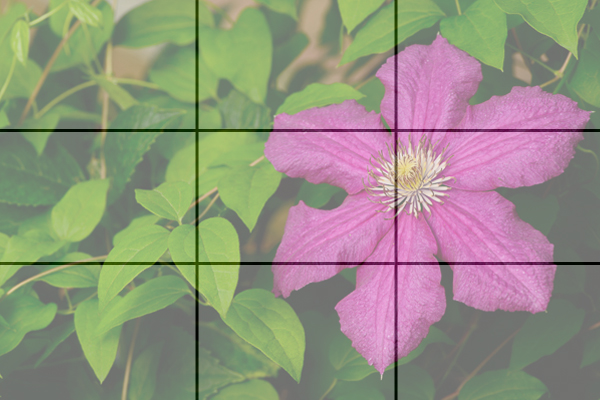
This composition will also work for landscape or still life photos. Placing objects along the grids or having objects “face” the open part of the frame creates a better composition. It works for many situations. Additionally, it can make a great starting point. When presented by a tricky scene try this to make your photos better with your new camera.

Frames Divided into Thirds

Still Life Rule of Thirds example - ©TimeLine Media
Still Life Rule of Thirds example – ©TimeLine Media
Still Life Rule of Thirds example - ©TimeLine Media
Still Life Rule of Thirds example – ©TimeLine Media

TimeLine Mediawww.timelinedc.com
703-864-8208
1 2 3 5