There are some constants that survive no matter how much photography evolves. Because of standards organizations, we had film speeds in ASA or ISO that now go by light sensitivity on digital cameras and F-stops for describing aperture openings. The softer “standards” that have survived include cropping dimensions of photos for presentation.
Photo Dimensions
8×10, 5×7 – these dimensions are some of the popular frame sizes that are sold here in the US. When my customers start looking at purchasing photos, these are the sizes that they purchase the most – why? These are the frames that are available in the decorator and craft stores. The problem? Look at the files that are coming out of your camera at this time. If you have a DSLR, the dimensions of the files that it makes are 4×6! This goes back to the days of film. 35mm film was the most popular consumer and small-format professional size of film that was available. For this reason, manufacturers keep the form of the cameras and the lenses the same as film cameras. With this in mind, most sensors have retained this ratio.
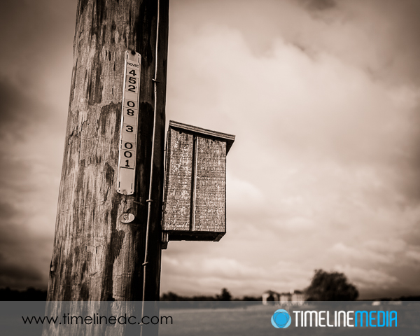
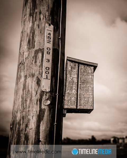
What this means is that if you want to have an 8×10 photo that is printed edge to edge, you need to crop your image files. Cropping is much easier in software than after the photos has been printed. It is non destructive, and it can also be used to improve composition of your image. To make an 8×10 image, the original file needs to be cropped down from 4×6 to 4×5 to fit on the page without borders. Here is an example:
8 X 10 Frames
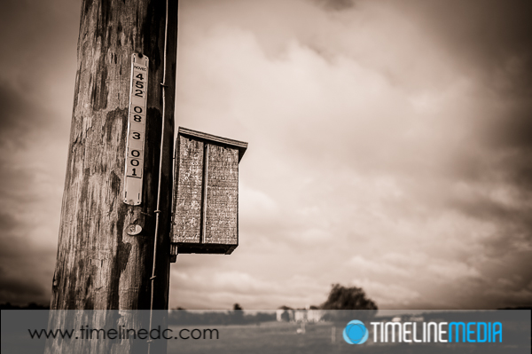
The 4×6 crop is more “panoramic” with a long dimension left to right in the frame. This is popular for landscapes and can give a better sense of scale. To fit this image into an 8×10 frame, however, a crop is needed. In trying to keep it close to the original composition, I didn’t move the frame in the software and came up with this:
The frame looks much different to me! Even though printed it would be a “larger” photo, I think it feels more cramped. It doesn’t convey the open space that the photo was taken, it seems like many of the elements are much closer together in the frame – the house in the background with the box in the foreground. Now changing the 8×10 crop to a portrait mode (where the longest size run up and down) the background house is a much smaller part of the images, an the emphasis goes back to the foreground. The best part is that you can change these easily in software until you really find the photo that suits you best.
TimeLine Media – www.timelinedc.com
703-864-8208

