Posts Tagged ‘portrait’

Dancer Portrait Session

©TimeLine Media - photography portrait session

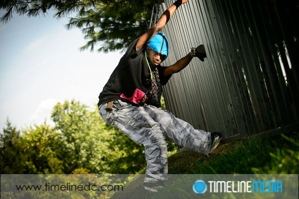
Recently, I have the opportunity to photograph a ballroom dancer, Tyrone, in a portrait session. He is not only an instructor in ballroom, but he also does hip-hop and contemporary dance which makes for some great photos. In this nice neighborhood, it was a challenge to find a background that was appropriate for the usual grungy backgrounds that accompany this type of dance. Tyrone was a great subject climbing into a tree to make it look like a setting much different than the suburban park that we were shooting. Being in a tree, and his clothing really made for a changing the setting with limited resources.

Outside Portraits

©TimeLine Media - photography portrait session
©TimeLine Media – photography portrait session

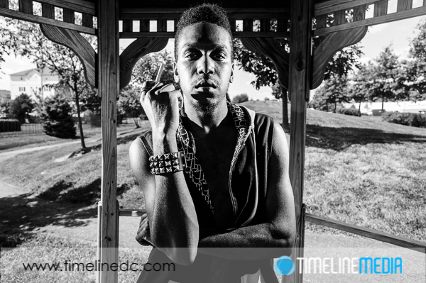
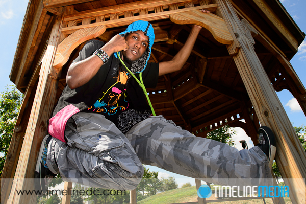
Then we found a nearby gazebo that he used to display his dance moves. I used the gazebo to try to get some nice even shade for photos, then added the flash to fill him in the frame of the structure. I also experimented with the flashes as hard side lights. Punching these up in post processing made for some interesting portraits that work better with male subjects. With the photos where he was hanging at one side of the gazebo, I used a super wide angle lens to emphasize his stretched frame making him look longer. I was trying to work the setting that we had to get a variety of photos.

©TimeLine Media - photography portrait session
©TimeLine Media – photography portrait session
©TimeLine Media - photography portrait session
©TimeLine Media – photography portrait session

The last section we went to was against a fence lining a walking trail. Fences always provide leading lines to point to your portrait subject, but I was looking for something different. Using the flash, I happened upon a happy accident. I was hoping that placing the flash on the other side of the fence would make for some sharp repeating shadows that would fall on Tyrone. This did happen a little, but the reflective paint on the slats of the fence created hard reflections against each other which focused the light. This made a nice vignette to light that I could use in the portraits. This is definitely a new trick that I will have to remember for future shoots!

©TimeLine Media - photography portrait session
©TimeLine Media – photography portrait session

TimeLine Media – www.timelinedc.com
703-864-8208

Great Gatsby Poster Part 1 – Tech Thursday

©TimeLine Media - portrait, background, and both merged

Movie Inspiration

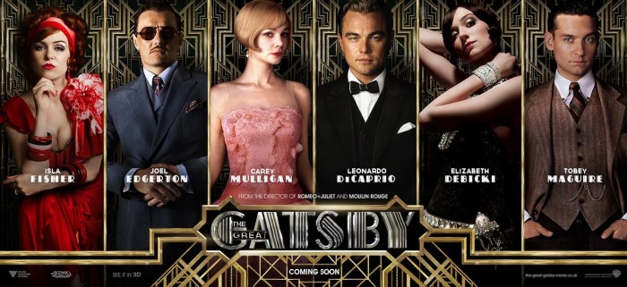
This project came out of an event happening at our dance studio this October. An upcoming theme night in October would be dedicated to the novel and movie, “The Great Gatsby” by F. Scott Fitzgerald. With such an over-the-top production as Baz Luhrmann is stylistically known to produce, the poster likewise had to reflect the movie. We looked over all the posters from the recently released movie and found several types for different settings. All the photography was amazing, as well as the graphic design for the setting of the portraits. This particular version I thought would work well:

The Great Gatsby poster © 2013 Warner Bros.

The poster would have to have 7 portraits of the staff of the dance studio, so this would be perfect. Initially I cut faces out from photos I already have from the dance events, but my limited Photoshop skills did not make it work. So, I asked the studio if I could make 3/4 portraits of the staff to use for the poster. They were all excited about the idea, and we knocked out the shoot in 2 hours!

Afterwards, I thought that maybe I could just swap portraits in for the ones already in the poster. That did not work as it would be too difficult to take out the people underneath cleanly before putting in the new portrait. By now, I realize that I really underestimated what it would take to make this poster happen. So I went back to the original poster, and looked into creating the Great Gatsby poster from scratch.

Poster Design

There are repeating background for each of the portraits, and the text and borders were metallic to resemble gates surrounding a large estate. Illustrator would be used to make the backgrounds designs. I started drawing straight up and down lines and diagonal lines exactly 45 degrees from the original lines. When the space was filled, I copied the design, and flipped it horizonally to make a mirror images on the other half of the drawing to make the top of the image.

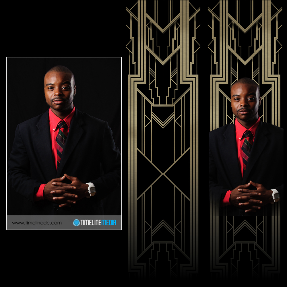
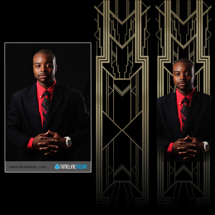
I then took these top two mirrored images, copied them together, and flipped it vertically to get the bottom half of the background. It actually turned out well! Here is how one of the portraits turned out. I’ll show you how I finished off the poster in a future post after the portraits and background were completed. From left to right are the starting portrait, the graphics made for the background, and both put together to be put into the poster.

©TimeLine Media - portrait, background, and both merged
©TimeLine Media – portrait, background, and both merged

TimeLine Media – www.timelinedc.com
703-864-8208
July 4 photos

©TimeLine Media - dachshund portrait

It was a really hot and humid day yesterday! Typical July 4th for the DC area. I spent the day with some family but did not take a break from making some photos. Hope everyone enjoyed a good day off!

Animal Portraits

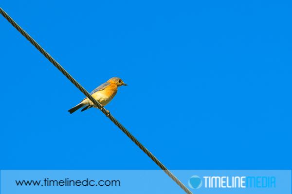
Yellow bird on a wire ©TimeLine Media

While on a walk out in the country, this beautiful yellow bird contrasted nice against the blue sky. Sometimes these elements come together easy for a photo! On this occasion, there was a complimentary color subject compared to the background. Additionally, there were no distracting elements with a cloudless sky. It can be that simple.

Pet Portraits

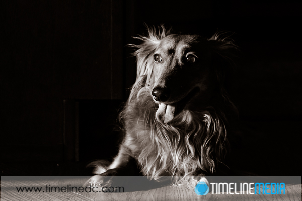
Dachshund photo in strong sunlight ©TimeLine Media
Dachshund portrait in strong sunlight ©TimeLine Media

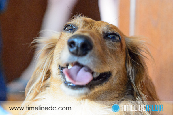
Coming back inside, I spent some time with some furry friends. Late in the afternoon, the strong setting sunlight made for dramatic lighting. When you pose a subject in strong sun, the background will fall of dramatically. As can be seen in this photo, the strong sunlight creates strong shadows on a face. This is similar to a bare flash head. For a dog’s face, this makes for a nice portrait. Always reward your pet portrait subjects with a belly rub!

Photos while getting a belly rub ©TimeLine Media

TimeLine Media – www.timelinedc.com
703-864-8208
1 20 21 22 23 24 25