Posts Tagged ‘Tilt shift’

Smithsonian Buildings Tilt Shift

Washington, DC

The blog has been very ballroom dance heavy the last week. The dancing photos have just been a big part of my computer time, so I had them at the top of mind lately. I’ll start switching the subject out today. A few weeks ago, I had the opportunity to walk around some Smithsonian museum buildings in Washington, DC.

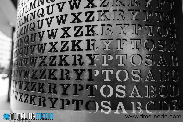
Kryptos statue - Washington, DC - ©TimeLine Media
Kryptos statue – Washington, DC – ©TimeLine Media

During the summertime months, the area is filled with groups of tourists, school groups, and other visitors to the city. Mixed with all the government workers going about their business, it is a busy time for this area. I blended in much more with the tourists pointing their cameras at all the recognizable buildings.

Lens Practice

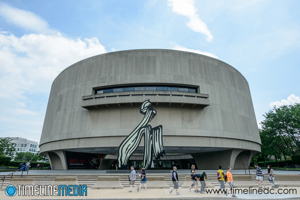
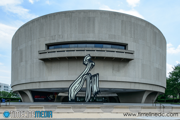
For this walk, I just had one lens on my camera – the 24mm PC-E tilt shift. I wanted to make more comparisons with some larger buildings than the ones in my neighborhood. The Hirshhorn Museum was one that I wanted to try. There are usually not as many pedestrians or large buses parked by the Jefferson Street side, so I went there for my test. Here are the two images, the first uncorrected with the camera pointing up towards the building, the second shifted to straighten the lines of the facade.

Hirshhorn Musem - Washington, DC - perspective uncorrected - ©TimeLine Media
Hirshhorn Musem – Washington, DC – perspective uncorrected – ©TimeLine Media
Hirshhorn Musem - Washington, DC - perspective corrected - ©TimeLine Media
Hirshhorn Musem – Washington, DC – perspective corrected – ©TimeLine Media

The second is really a different view than what you see as you drive by. The main circular section looks to be suspended in mid air one story above street level. As you take photos of the building when you walk by, the “leaning back” perspective is what you normally see from close below the structure. The corrected version seems so straight, that it does not look right to my eyes! When drawing straight lines, though, everything lines up as it would on a sheet of paper if you were making a blueprint of the building. This was my first try, and it will probably not be the last time that I go back to a familiar place that I am accustomed to seeing with distorted vision due to perspective.

TimeLine Media – www.timelinedc.com
703-864-8208

Software Perspective Correction

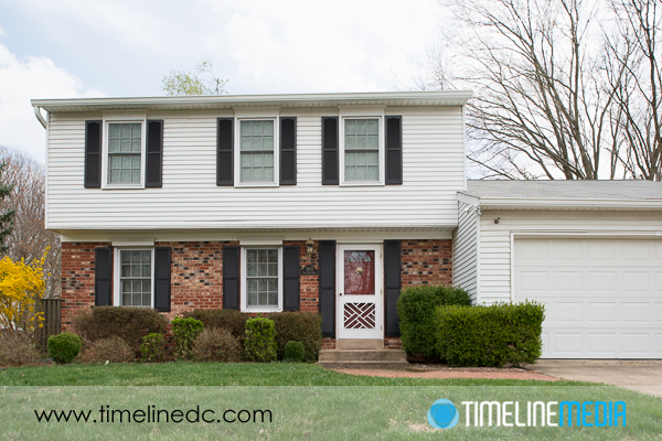
Final software corrected image

Post Processing

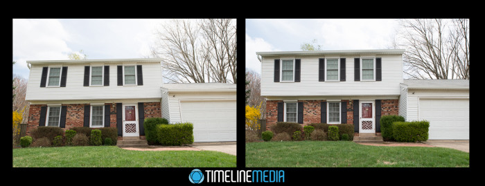
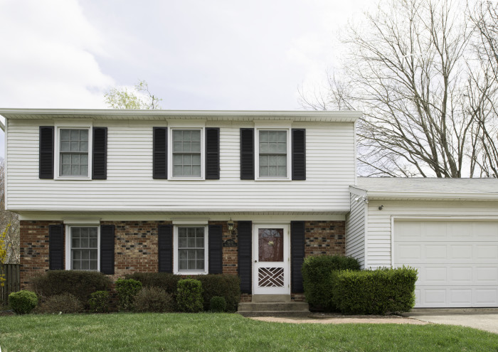
Thanks to feedback from my photographer friend, Jae, I decided to try editing the photo from yesterday’s post in software. In that case, I compared two images from a Nikon PC (perspective correction) or tilt-shift lens. Overall you can use this special lens to straighten angles of buildings that you photograph. Concurrently, the images will not have that “falling away” look. This is usually what you get when the camera is pointed up towards the top. With this in mind, here is a repost of the two images – the one on the left uncorrected, and the one on the right straightened.

Tilt Shift comparison - ©TimeLine Media
Tilt Shift comparison – ©TimeLine Media

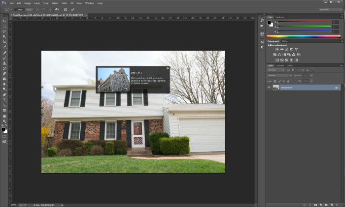
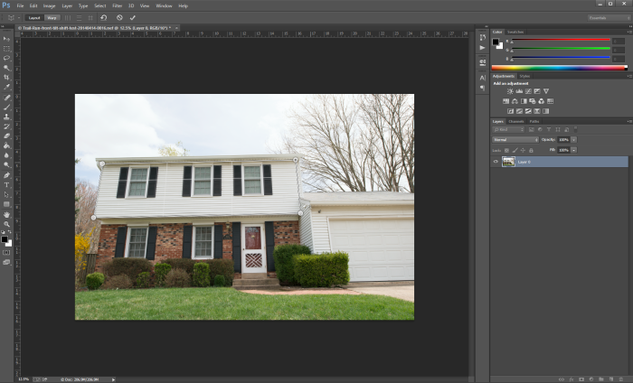
Today, I attempted to do the same correction on the left photos, but in Photoshop CC to see how close you can get in post. In Photoshop, I selected the Perspective Warp tool by selecting it under the Edit menu. This is the dialog box that pops up:

Adobe Photoshop

Adobe Photoshop Perspective Warp - 1
Adobe Photoshop Perspective Warp – 1

It tells you to draw a box around the areas that you would like to straighten. I go for the top half of the house as this is where I saw the biggest change in the photo.

Adobe Photoshop Perspective Warp - 2
Adobe Photoshop Perspective Warp – 2

Next, I moved the corner dots to the edges of that section of the house that I wanted to line up:

Adobe Photoshop Perspective Warp - 3
Adobe Photoshop Perspective Warp – 3

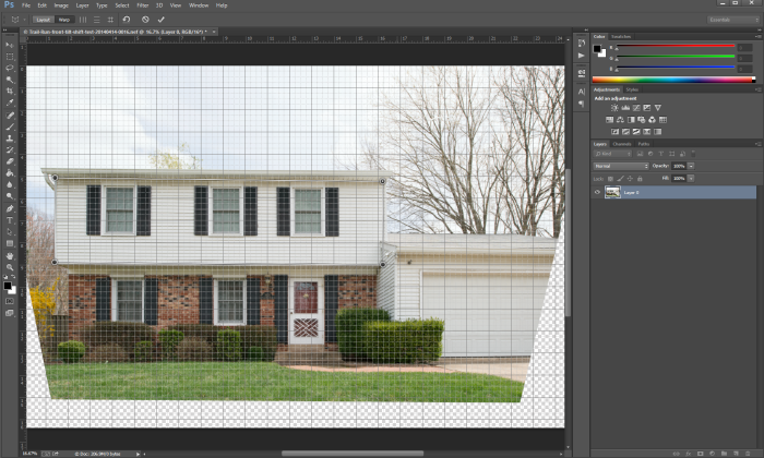
Turning on the Grid lines, it makes it easier to adjust the dots to be straight to each other, and the rest of the photo adjusts along with them:

Adobe Photoshop Perspective Warp - 4
Adobe Photoshop Perspective Warp – 4

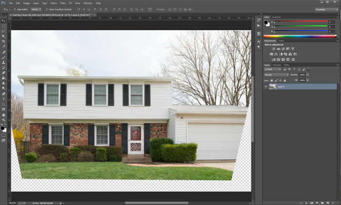
Clicking the check mark gives you this image:

Adobe Photoshop Perspective Warp - 5
Adobe Photoshop Perspective Warp – 5

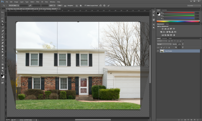
This is very close to the corrected image! Unfortunately, you can see how much of the photo needs to be cropped out, which means that I will lose some of the structure in order to fill in the black background.

Adobe Photoshop Perspective Warp - 6
Adobe Photoshop Perspective Warp – 6

This is the real power of the tilt shift lens. In this case, the background is just made of lawn and driveway. You may need to have that area for indoor photos, or other larger projects. This also shows that this is a very specialized lens that will really show its magic in specific circumstances. It was fun trying this tool in Photoshop, and am happy that I could use this in a pinch! I would just need to set the camera back a little farther if I want to get more in the frame.

Final software corrected image

TimeLine Media – www.timelinedc.com
703-864-8208
Tilt Shift Lenses – Part 1– Tech Thursday

Shift corrected house photo - ©TimeLine Media

Straight Lines

Very good photographers visualize the world differently. There are stories of people that claim to see the world at certain focal lengths. Commonly 35mm or 50mm on a full frame camera. I don’t know if I am that in tune with my gear, but I am getting much better at pre-visualizing an image before I set the camera.

Architects, similarly, view structures in much the same way. My father was an architect, and I watching him draw buildings out of a blank sheet of paper reveals how he views structures from different perspectives. Another characteristic of most blue prints is that there is no distortion of the angles in the drawings. It is important to keep them straight to make it clear to engineers and builders which angles should be straight in case there are others that they are intentionally changing for design. A tilt shift lens will allow you to straighten all the angles in an image, and remove the distortion that comes from the angle of the camera to the building.

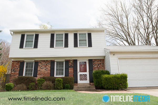
Uncorrected house photo - ©TimeLine Media
Uncorrected house photo – ©TimeLine Media

Above is an example of a non-corrected image from a 24mm lens. Because the camera and lens is pointed up towards the building, it makes the top of the house look like it is falling away. The straight sides of the structure seem to be converging at the top of the frame. This is an angle that would not be drawn by an architect. It would be confusing, and not representative of how they would want the structure to be built. Here is a corrected version of the same scene:

Shift Correction

Shift corrected house photo - ©TimeLine Media
Shift corrected house photo – ©TimeLine Media

The camera position was not changed between these two images as it was mounted on a tripod. Only the shift function of the tilt shift lens was changed, and the camera angle pointed straight towards the building. This is the magic of the tilt shift lens. You remove the distortion by straightening the angle of the camera to the house, then shift the lens so you can still capture the entire front façade of the building in one frame. I will show how the lens looks and how it makes these changes in a future post.

Tilt Shift comparison - ©TimeLine Media
Tilt Shift comparison – ©TimeLine Media

TimeLine Media – www.timelinedc.com
703-864-8208