Posts Tagged ‘DC’

Special Event Lighting – Tech Thursday

©TimeLine Media - DC Dance Challenge

White Balance

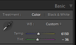
When shooting color images, digital photography gives us a lot more flexibility in color balance. This is usually one of the first options that photo applications will let you adjust in your photos. In Adobe Lightroom, they call this “Temperature” referring to the Kelvin setting in degrees. On the lower end of the scale are the “cooler” or bluer settings starting at 2000K. On the other end is going to the “warmer” or yellower settings 10000K to 50000K.

Lightroom - color temperature slider
Lightroom – color temperature slider

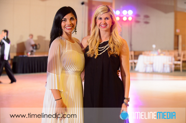
Similarly to a previous post which I talked about bouncing the light off of colored walls, having mixed lighting sources will also affect the look of your photos. At events where there is lighting setup to set a mood for the room, you will have strongly colored constant lights. These will usually be tinted with a gel or LEDs that can make every kind of color possible. This can be difficult to balance, as now there are competing sources of color in your frames.

Ballroom Dance Photos

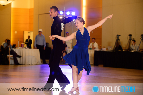
©TimeLine Media - DC Dance Challenge ballroom dance
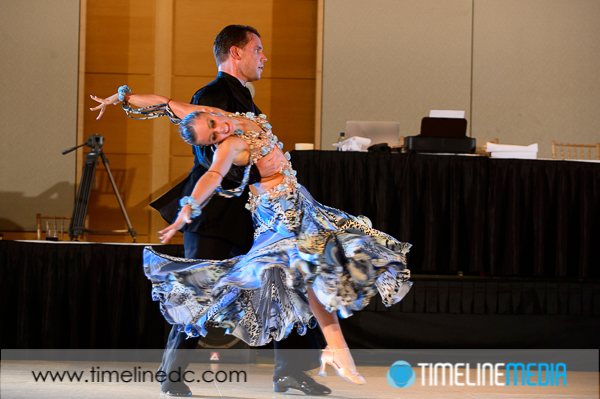
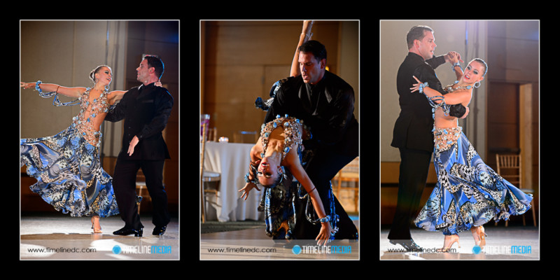
©TimeLine Media – DC Dance Challenge ballroom dance event lighting

My thought in this situation is to use my flash to get the best exposure I can at the time. Having a good exposure means I can work with the file more easily in Lightroom later. The dance events usually has changing lights, so I cannot do a good white balance for each color, I just have to make a good exposure.

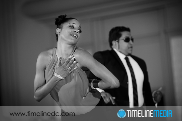
Back in Lightroom, I use the temperature and tint sliders to ensure that the skin of subjects in the frame looks good. It may not be exactly their skin tone as you see it, but neither is their color on the dance floor flooded with colored light. The downside is that the colored light in the background, or the ambient color of the room may change, but skin tones are my only concern. Whatever colors happen to change in the background or other room elements will have to be left as is. Let me know what you guys do when facing these room a wedding receptions, or other setups with special event lighting.

©TimeLine Media - DC Dance Challenge
©TimeLine Media – DC Dance Challenge

TimeLine Media – www.timelinedc.com
703-864-8208

John King & Maria Papakonstantinou

©TimeLine Media - John King & Maria Papakonstantinou

It’s finally Friday! The photos from the DC Dance Challenge are still on sale until Monday, October 28, 2013. That is a 20% off sale on ALL products that are available on the website. This includes prints on paper, prints mounted on canvas or matboard, and digital downloads for sharing online, or storing for future prints. To view all the photos from the events, here is a direct link at the proofing wesbsite:

http://proofs.timelinedc.com

Another treat in covering the 2013 DC Dance Challenge was the opportunity to make some photos  from the two shows performed by John King & Maria Papakonstantinou. After judging the competitors all day, John and Maria treated the evening audience to an amazing display. They are the current Unites States and World Pro-Am Rhythm Champions! With the Ohio Star Ball coming up, I think they would be a good bet to repeat this year.

©TimeLine Media - John King & Maria Papakonstantinou
©TimeLine Media – John King & Maria Papakonstantinou


This first show had a great music track – with changes in dynamics and tempo. This goes along with their quick changes in their dance styles in one routine. It covered the entire floor, and had everyone focused on them throughout the performance. Because this is the first time I have photographed them, I really wish I had the chance to watch this one again without having to follow them from behind the camera. If anyone has a link to a video of this performance, please let me know!

©TimeLine Media - John King & Maria Papakonstantinou
©TimeLine Media – John King & Maria Papakonstantinou

TimeLine Media – www.timelinedc.com
703-864-8208
Great Gatsby Gala – Tech Thursday

©TimeLine Media - poster base image

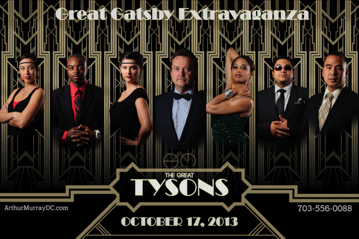
Time really flies! Today is the Great Gatsby Gala at the Arthur Murray – Tysons Corner, VA studio. A few months ago, I asked the staff if they would like to create a poster to advertise the theme of the party. This was back in the summer when the new Great Gatsby movie was still in theaters. In a few posts, I showed some of the steps that went into making the poster. One aspect that I used in the poster but did not blog about was the use of layers to place the portraits into one image.

Movie Poster

©TimeLine Media - Arthur Murray - Tysons Corner poster
©TimeLine Media – Arthur Murray – Tysons Corner poster

In the poster, the portraits were cut out very close to the edges of each person’s form. This will not work, though, for most action photos taken of dancers on the dance floor. If you have seen us at events, you probably have seen some posters that I have created with these shots, and I do them a little differently. In this example, I start with a large base image that I changed to black and white since it will be the background for the whole poster.

©TimeLine Media - poster base image
©TimeLine Media – poster base image

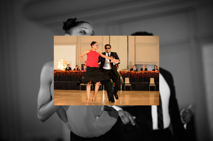
Next, I take another image, and overlay it right on top of this one. Automatically, Photoshop will put this on a new layer:

©TimeLine Media - poster in-process - 1
©TimeLine Media – poster in-process – 1

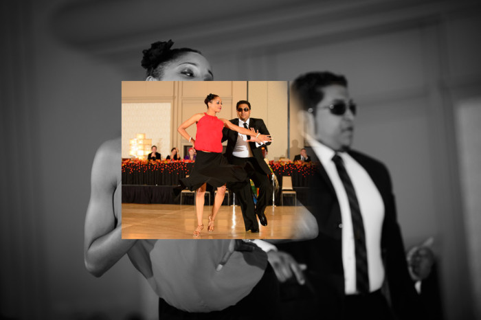
I then add a layer mask to this new layer. The default for the mask is to be completely white meaning the entire layer is in view. Then, I select the layer mask, and choose a black brush with hardness turned down to 0%, and brush black onto the layer mask which removes the edges from the color image:

©TimeLine Media - poster in-process - 2
©TimeLine Media – poster in-process – 2

Here is a look at the final layer toolbar when all the images, layer masks, and edits are added:

Photoshop Layers Toolbar

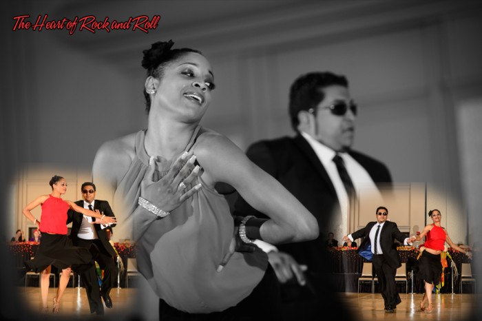
And finally, here is the example poster created with these edits. It contains 3 images from this show, 2 layer masks that blend the color images over the monochrome background image, and some text with the song name. It is a different way to combine multiple images into one setting. The result is a little more organic or free-flowing compared to hard edges. Both will work!

©TimeLine Media - Heart Of Rock and Roll
©TimeLine Media – Heart Of Rock and Roll

TimeLine Media – www.timelinedc.com
703-864-8208
1 61 62 63 64 65 100