Posts Tagged ‘VA’

Rush

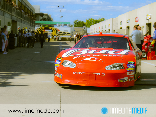
©TimeLine Media - NASCAR car in paddock with split tone

Many good photographers have written about  using other art forms to improve your photography. Master painters take light and shape in combination to guide viewers eyes through their compositions, and grab their attention. Being a still photographer, I have looked at paintings as well as other photographers in trying to improve my photography. I did not consider how movies can do the same. Although they may seem similar, and may use much similar equipment, motion pictures require an entirely different mindset to execute well.

Movie Inspiration

Ron Howard, being one of the best directors currently working, recently released the movie “Rush” about two rival race car drivers that competed for the 1976 F1 Championship in auto racing. Saying that the Academy-award winning Ron Howard knows what he is doing is more than an understatement, but I came away with some thoughts about how a photographer and blogger can relate to this depiction of world class competition at a specific time.

©TimeLine Media - NASCAR car in paddock
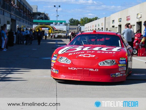
©TimeLine Media – NASCAR car in paddock
©TimeLine Media - NASCAR car in paddock with split tone
©TimeLine Media – NASCAR car in paddock with split tone

The filmmakers not only had the actors, decor, and cars in the movie styled for the time, but there was a hint of toning throughout that set the period for the early to mid-1970’s. It was subtle, much like the split tone effect on the photo above, but it gave an overall feel to the movie as a whole that placed them in the correct time period. It would probably have still worked without this color treatment, but it’s addition was a nice detail.

Motorsports Photos

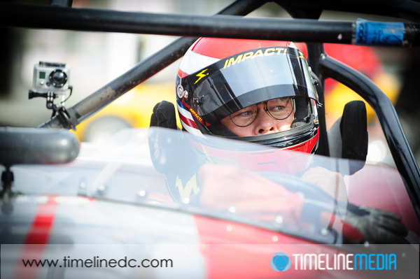
©TimeLine Media - racer in car before race start
©TimeLine Media – racer in car before race start

The action is the draw of the sport. It is a display of skill, speed, and determination. But there are personalities, and stories off the track. In the movie, the rival drivers have two completely different mindsets in their approach to racing. The movie shows the lifestyle of the drivers off the track mirrored their style on the track. It furthers the story, allows the viewers to make their own opinions, and it made me want to research further about their rivalry.

Happily, the filmmakers stayed true to many of the details of this time. With the blessing of many of the people that lived this piece of racing history, the story was an excellent portrayal of the best F1 racers of that time. I will have this in the back of my mind the next time I will cover a sporting event, a wedding, or any significant event for someone that is looking for photos. I would like my photos to tell a story much like this movie – both accurate to the events taking place, and compelling to view for those that were there, and those who will look back on the images in the future.

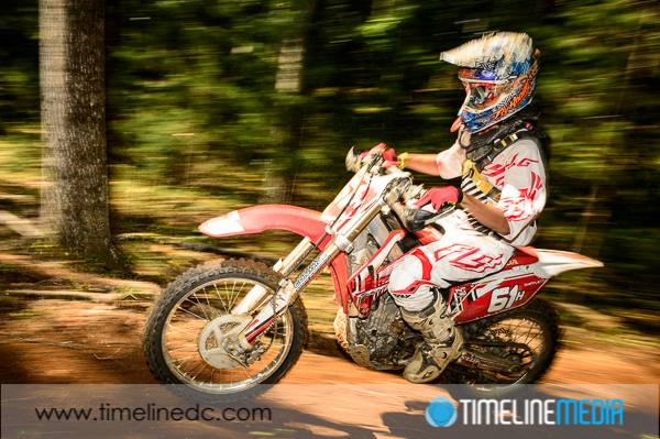
©TimeLine Media - motocross racing
©TimeLine Media – motocross racing

 TimeLine Media – www.timelinedc.com
703-864-8208

John King & Maria Papakonstantinou

©TimeLine Media - John King & Maria Papakonstantinou

It’s finally Friday! The photos from the DC Dance Challenge are still on sale until Monday, October 28, 2013. That is a 20% off sale on ALL products that are available on the website. This includes prints on paper, prints mounted on canvas or matboard, and digital downloads for sharing online, or storing for future prints. To view all the photos from the events, here is a direct link at the proofing wesbsite:

http://proofs.timelinedc.com

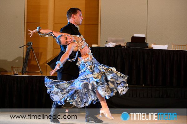
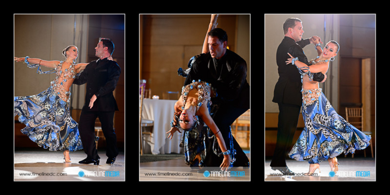
Another treat in covering the 2013 DC Dance Challenge was the opportunity to make some photos  from the two shows performed by John King & Maria Papakonstantinou. After judging the competitors all day, John and Maria treated the evening audience to an amazing display. They are the current Unites States and World Pro-Am Rhythm Champions! With the Ohio Star Ball coming up, I think they would be a good bet to repeat this year.

©TimeLine Media - John King & Maria Papakonstantinou
©TimeLine Media – John King & Maria Papakonstantinou


This first show had a great music track – with changes in dynamics and tempo. This goes along with their quick changes in their dance styles in one routine. It covered the entire floor, and had everyone focused on them throughout the performance. Because this is the first time I have photographed them, I really wish I had the chance to watch this one again without having to follow them from behind the camera. If anyone has a link to a video of this performance, please let me know!

©TimeLine Media - John King & Maria Papakonstantinou
©TimeLine Media – John King & Maria Papakonstantinou

TimeLine Media – www.timelinedc.com
703-864-8208
Great Gatsby Gala – Tech Thursday

©TimeLine Media - poster base image

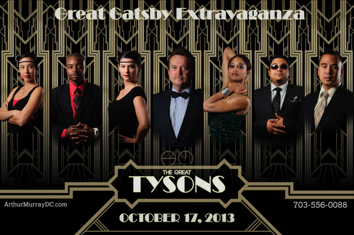
Time really flies! Today is the Great Gatsby Gala at the Arthur Murray – Tysons Corner, VA studio. A few months ago, I asked the staff if they would like to create a poster to advertise the theme of the party. This was back in the summer when the new Great Gatsby movie was still in theaters. In a few posts, I showed some of the steps that went into making the poster. One aspect that I used in the poster but did not blog about was the use of layers to place the portraits into one image.

Movie Poster

©TimeLine Media - Arthur Murray - Tysons Corner poster
©TimeLine Media – Arthur Murray – Tysons Corner poster

In the poster, the portraits were cut out very close to the edges of each person’s form. This will not work, though, for most action photos taken of dancers on the dance floor. If you have seen us at events, you probably have seen some posters that I have created with these shots, and I do them a little differently. In this example, I start with a large base image that I changed to black and white since it will be the background for the whole poster.

©TimeLine Media - poster base image
©TimeLine Media – poster base image

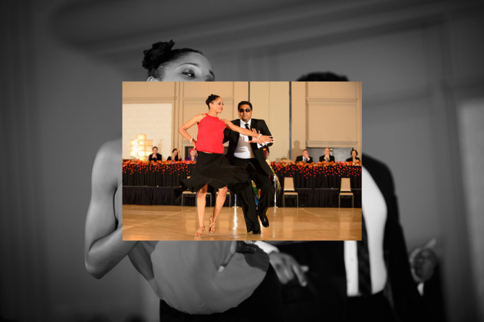
Next, I take another image, and overlay it right on top of this one. Automatically, Photoshop will put this on a new layer:

©TimeLine Media - poster in-process - 1
©TimeLine Media – poster in-process – 1

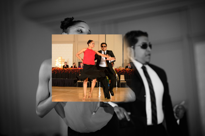
I then add a layer mask to this new layer. The default for the mask is to be completely white meaning the entire layer is in view. Then, I select the layer mask, and choose a black brush with hardness turned down to 0%, and brush black onto the layer mask which removes the edges from the color image:

©TimeLine Media - poster in-process - 2
©TimeLine Media – poster in-process – 2

Here is a look at the final layer toolbar when all the images, layer masks, and edits are added:

Photoshop Layers Toolbar

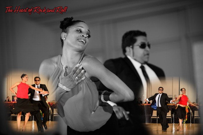
And finally, here is the example poster created with these edits. It contains 3 images from this show, 2 layer masks that blend the color images over the monochrome background image, and some text with the song name. It is a different way to combine multiple images into one setting. The result is a little more organic or free-flowing compared to hard edges. Both will work!

©TimeLine Media - Heart Of Rock and Roll
©TimeLine Media – Heart Of Rock and Roll

TimeLine Media – www.timelinedc.com
703-864-8208
1 138 139 140 141 142 206