Posts Tagged ‘Great Gatsby’

Great Gatsby Gala – Tech Thursday

©TimeLine Media - poster base image

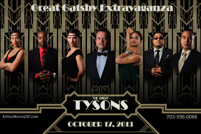
Time really flies! Today is the Great Gatsby Gala at the Arthur Murray – Tysons Corner, VA studio. A few months ago, I asked the staff if they would like to create a poster to advertise the theme of the party. This was back in the summer when the new Great Gatsby movie was still in theaters. In a few posts, I showed some of the steps that went into making the poster. One aspect that I used in the poster but did not blog about was the use of layers to place the portraits into one image.

Movie Poster

©TimeLine Media - Arthur Murray - Tysons Corner poster
©TimeLine Media – Arthur Murray – Tysons Corner poster

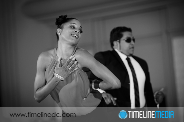
In the poster, the portraits were cut out very close to the edges of each person’s form. This will not work, though, for most action photos taken of dancers on the dance floor. If you have seen us at events, you probably have seen some posters that I have created with these shots, and I do them a little differently. In this example, I start with a large base image that I changed to black and white since it will be the background for the whole poster.

©TimeLine Media - poster base image
©TimeLine Media – poster base image

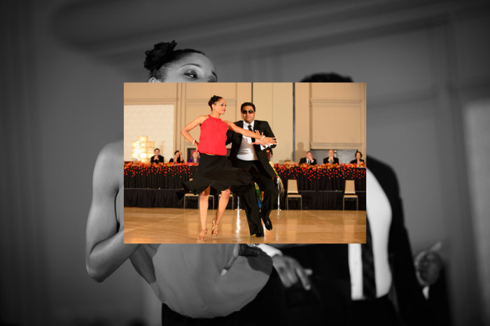
Next, I take another image, and overlay it right on top of this one. Automatically, Photoshop will put this on a new layer:

©TimeLine Media - poster in-process - 1
©TimeLine Media – poster in-process – 1

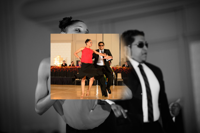
I then add a layer mask to this new layer. The default for the mask is to be completely white meaning the entire layer is in view. Then, I select the layer mask, and choose a black brush with hardness turned down to 0%, and brush black onto the layer mask which removes the edges from the color image:

©TimeLine Media - poster in-process - 2
©TimeLine Media – poster in-process – 2

Here is a look at the final layer toolbar when all the images, layer masks, and edits are added:

Photoshop Layers Toolbar

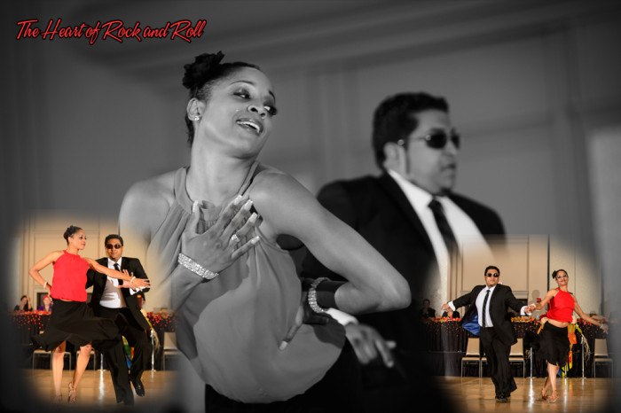
And finally, here is the example poster created with these edits. It contains 3 images from this show, 2 layer masks that blend the color images over the monochrome background image, and some text with the song name. It is a different way to combine multiple images into one setting. The result is a little more organic or free-flowing compared to hard edges. Both will work!

©TimeLine Media - Heart Of Rock and Roll
©TimeLine Media – Heart Of Rock and Roll

TimeLine Media – www.timelinedc.com
703-864-8208

Great Gatsby Poster Part 1 – Tech Thursday

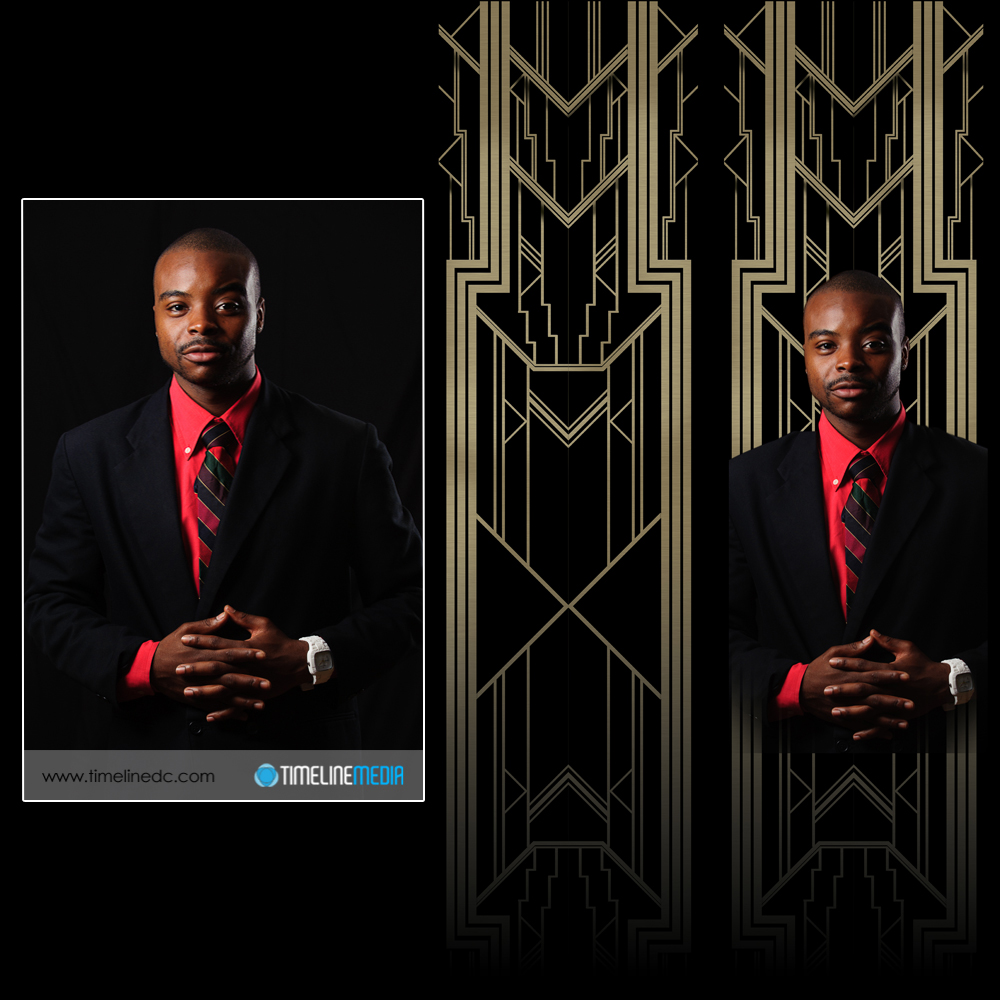
©TimeLine Media - portrait, background, and both merged

Movie Inspiration

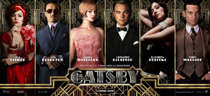
This project came out of an event happening at our dance studio this October. An upcoming theme night in October would be dedicated to the novel and movie, “The Great Gatsby” by F. Scott Fitzgerald. With such an over-the-top production as Baz Luhrmann is stylistically known to produce, the poster likewise had to reflect the movie. We looked over all the posters from the recently released movie and found several types for different settings. All the photography was amazing, as well as the graphic design for the setting of the portraits. This particular version I thought would work well:

The Great Gatsby poster © 2013 Warner Bros.

The poster would have to have 7 portraits of the staff of the dance studio, so this would be perfect. Initially I cut faces out from photos I already have from the dance events, but my limited Photoshop skills did not make it work. So, I asked the studio if I could make 3/4 portraits of the staff to use for the poster. They were all excited about the idea, and we knocked out the shoot in 2 hours!

Afterwards, I thought that maybe I could just swap portraits in for the ones already in the poster. That did not work as it would be too difficult to take out the people underneath cleanly before putting in the new portrait. By now, I realize that I really underestimated what it would take to make this poster happen. So I went back to the original poster, and looked into creating the Great Gatsby poster from scratch.

Poster Design

There are repeating background for each of the portraits, and the text and borders were metallic to resemble gates surrounding a large estate. Illustrator would be used to make the backgrounds designs. I started drawing straight up and down lines and diagonal lines exactly 45 degrees from the original lines. When the space was filled, I copied the design, and flipped it horizonally to make a mirror images on the other half of the drawing to make the top of the image.

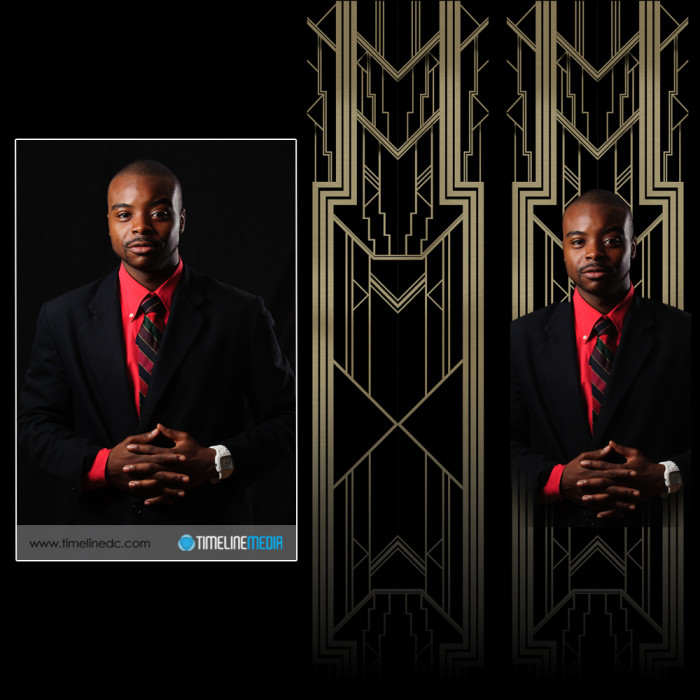
I then took these top two mirrored images, copied them together, and flipped it vertically to get the bottom half of the background. It actually turned out well! Here is how one of the portraits turned out. I’ll show you how I finished off the poster in a future post after the portraits and background were completed. From left to right are the starting portrait, the graphics made for the background, and both put together to be put into the poster.

©TimeLine Media - portrait, background, and both merged
©TimeLine Media – portrait, background, and both merged

TimeLine Media – www.timelinedc.com
703-864-8208