Posts Tagged ‘Tech Thursday’

iPhone vs. DSLR in Early Morning – Tech Thursday

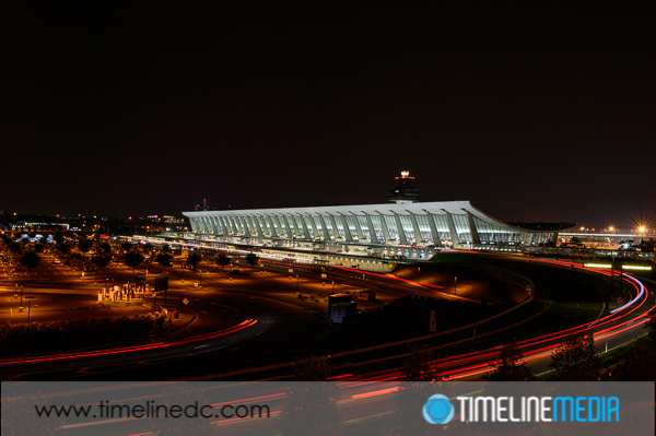
©TimeLine Media - Dulles Airport Main Terminal - Nikon D4

Earlier this week, I needed to bring my uncle to the airport for an early morning departure. With a 6:30 departure time, it was a VERY early morning for us. With the days being so long in the summer, I have not had the inspiration to get up before the sun. This is the best time to get landscape or architecture photos. Unfortunately this time was a little TOO early since the sky was still black as night, but I took advantage of the beautiful Main Terminal at Dulles International Airport to make photos of another landmark of the Washington, DC area. I tried making images with both the iPhone and my DSLR for comparison.

My father, an architect that had a great appreciation for clean, contemporary design, would always start to lecture as we approached this building. Designed by Finnish-American architect Eero Saarinen, the main terminal at Dulles is a panoramic structure of concrete and glass that echoes the air supporting the planes coming into and out of the airport. My dad would talk about the open concept interior, the rain management system that you do not even notice in the center of the airport, and the overall design that still looks modern even though it was designed in the 1950’s. The airport was just starting to wake up. There was minimal activity and traffic going into the terminal at 5AM in the morning. I found a nice spot in the Daily Garage closest to the main terminal. Walking to the top level to provides a nice clear view of the main terminal. Here is are the completely images from both uncropped, out of the camera:

Comparing iPhone Imaging
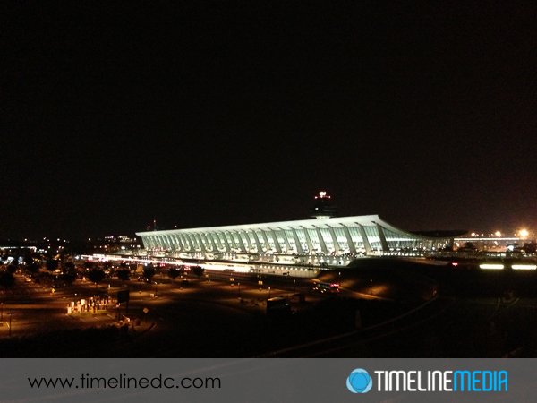
©TimeLine Media - Dulles Airport Main Terminal - iPhone
©TimeLine Media – Dulles Airport Main Terminal – iPhone
©TimeLine Media - Dulles Airport Main Terminal - Nikon D4
©TimeLine Media – Dulles Airport Main Terminal – Nikon D4


I was a little surprised at the results. The iPhone did remarkably well considering what I was asking it to do. I had put the exposure measurement cursor right in the middle of the terminal. The default image would have made the terminal overexposed without any detail. In this case the camera compensates for the large portion of the frame that was dark, or completely black. This image would be sufficient for using on Instagram or Facebook if you are just establishing where you were travelling.

Comparing DSLR Imaging

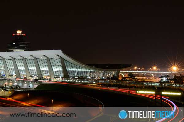
When I setup the DSLR, I put the camera right on the edge of the wall of the garage to stabilize the camera, and manually set the exposure. I wanted it to be similar – with the terminal not over exposed. With the controls that are available on the DSLR, I set the aperture down to f/11 so that the exposure time is increased to 5 seconds. This makes for some really cool light trails from the cars coming into the terminal! This is really the main difference between these two photos when zoomed out to their default views.

As expected, though, the iPhone image really loses when you zoom in to see any detail in the photo. These conditions are really pushing the limits of the tiny sensor in this camera which is best when used in bright conditions. When you zoom into the DSLR photo, you can also see some nice star-like flares in the lights on the tarmac behind the terminal. These are a result of the aperture of f/11 which is a much smaller opening than f/2.4 that the iPhone was using to try to get as much light into the camera. This example clearly shows a few of the features that a camera with full controls can get for you compared to point-and-shoot or smartphone cameras.
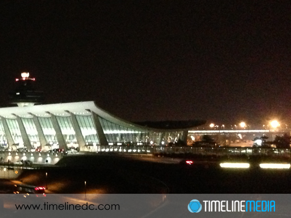
©TimeLine Media - Dulles Airport Main Terminal - iPhone
©TimeLine Media – Dulles Airport Main Terminal – iPhone
©TimeLine Media - Dulles Airport Main Terminal - Nikon D4
©TimeLine Media – Dulles Airport Main Terminal – Nikon D4

TimeLine Media – www.timelinedc.com
703-864-8208

Great Gatsby Poster Part 1 – Tech Thursday

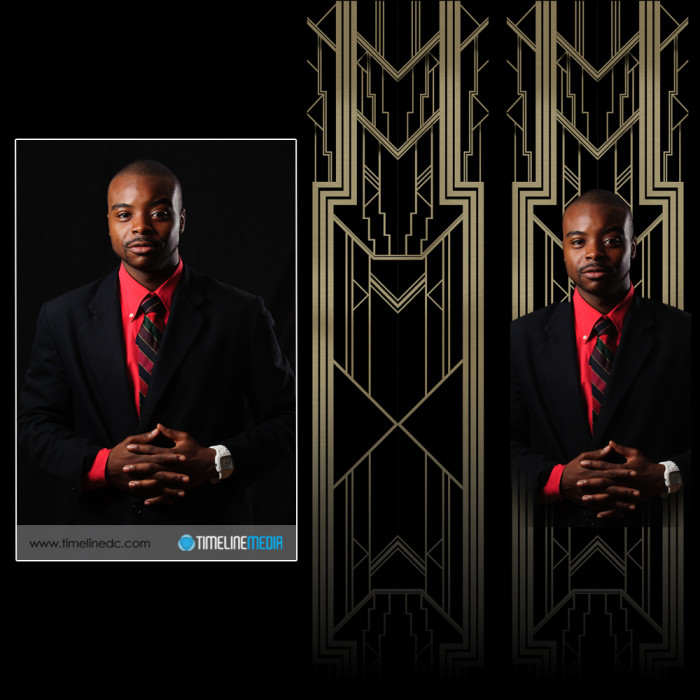
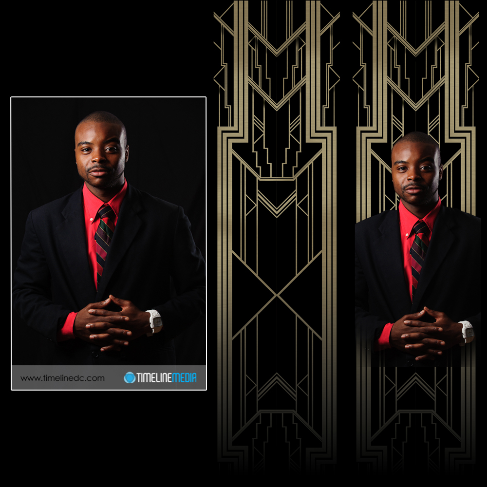
©TimeLine Media - portrait, background, and both merged

Movie Inspiration

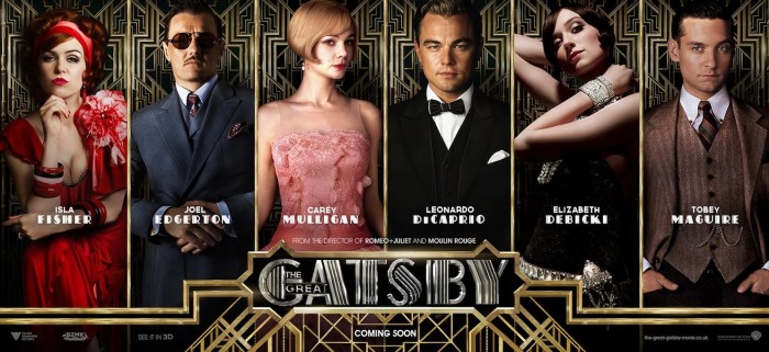
This project came out of an event happening at our dance studio this October. An upcoming theme night in October would be dedicated to the novel and movie, “The Great Gatsby” by F. Scott Fitzgerald. With such an over-the-top production as Baz Luhrmann is stylistically known to produce, the poster likewise had to reflect the movie. We looked over all the posters from the recently released movie and found several types for different settings. All the photography was amazing, as well as the graphic design for the setting of the portraits. This particular version I thought would work well:

The Great Gatsby poster © 2013 Warner Bros.

The poster would have to have 7 portraits of the staff of the dance studio, so this would be perfect. Initially I cut faces out from photos I already have from the dance events, but my limited Photoshop skills did not make it work. So, I asked the studio if I could make 3/4 portraits of the staff to use for the poster. They were all excited about the idea, and we knocked out the shoot in 2 hours!

Afterwards, I thought that maybe I could just swap portraits in for the ones already in the poster. That did not work as it would be too difficult to take out the people underneath cleanly before putting in the new portrait. By now, I realize that I really underestimated what it would take to make this poster happen. So I went back to the original poster, and looked into creating the Great Gatsby poster from scratch.

Poster Design

There are repeating background for each of the portraits, and the text and borders were metallic to resemble gates surrounding a large estate. Illustrator would be used to make the backgrounds designs. I started drawing straight up and down lines and diagonal lines exactly 45 degrees from the original lines. When the space was filled, I copied the design, and flipped it horizonally to make a mirror images on the other half of the drawing to make the top of the image.

I then took these top two mirrored images, copied them together, and flipped it vertically to get the bottom half of the background. It actually turned out well! Here is how one of the portraits turned out. I’ll show you how I finished off the poster in a future post after the portraits and background were completed. From left to right are the starting portrait, the graphics made for the background, and both put together to be put into the poster.

©TimeLine Media - portrait, background, and both merged
©TimeLine Media – portrait, background, and both merged

TimeLine Media – www.timelinedc.com
703-864-8208
ISO – Tech Thursday

©TimeLine Media - ISO 8000 digital

For my professional photography career, I have been digital all the way. I am not nostalgic about the hey day of using film when capturing images. In the few times that I have used film, there is not much different in the way that the camera works. With later Nikon SLRs, the mechanics and ergonomics are almost exactly the same without the screen on the back for viewing images, of course. And then there is the ISO button.

One setting that is different on digital SLRs compared to film is the ISO button. This setting relates to the light sensitivity setting of the sensor and what I think what allowed digital photography to surpass film in quality and usability. Here is the reason why. ISO refers to the International Organization of Standards that creates the universal criteria for a variety of measures.

ISO Rating

The lower the ISO number on your camera, the LESS sensitive your sensor is to light (ie 100 or 200) . The higher the ISO number, the MORE light sensitive your sensor is to the light hitting the back of the camera (ie 1600, 3200 and higher). Back in the film days, you used to have to choose your film speed when you were at the store. This corresponds to the ISO setting in digital cameras. They would sell photos for bright daylight which would be ISO 100 or ISO 200, or you would choose an all-around film which would be rated at ISO 400, or you could get action film which usually would be black and white and be rated for 1600 or 3200.

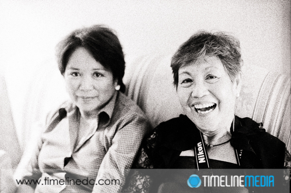
Why would you choose one over the other? In photography there are always trade-offs. In film, it is grain, in digital capture, it is digital noise. As your sensitivity goes up, so does the amount of grain or noise in your image. The lower ISO values give you the cleanest image without little dots of noise that do not accurately have represent the scene. Higher ISO values may introduce noise or grain artifacts, but it is possible for you to capture a sharp image with faster shutter speeds. Sometimes getting ANY image no matter how grainy is better than getting a completely blurry image without any grain. This was important for photo journalists that needed to get sports shots, or images in bad light without added lighting, and still be sharp enough for printing in the newspaper. Here is an example of a photo taken with Kodak T-Max that is ISO 3200:

©TimeLine Media - ISO 3200 film
©TimeLine Media – ISO 3200 film

Digital Grain

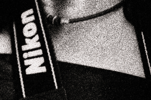
Yes, there is lots of grain in the image! But considering there was no added flash, and using only the ambient light from lamps in the room, you do get a sharp image, and you can make out the subject. Here is a 100% crop from this frame really showing the grain from the film:

©TimeLine Media - ASA 3200 film
©TimeLine Media – ISO 3200 film


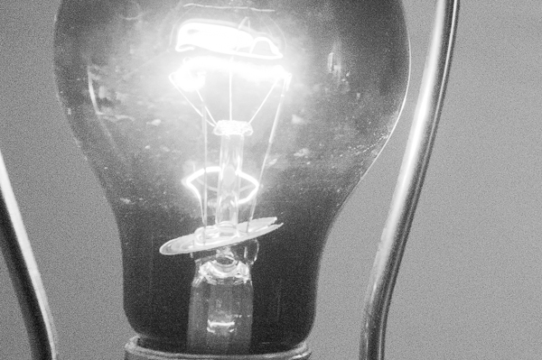
With digital photography changing at a rapid pace, the ability to shoot at higher ISO has become the next technological marking stick. Manufacturers have been making cameras that can shoot at higher and higher sensitivities. The magic in new hardware and software allows for this increased sensitivity without adding much noise to the image. Here is an example from a DSLR at ISO 8000 – almost 2 stops more sensitive than the film images above!

©TimeLine Media - ASA 8000 digital
©TimeLine Media – ISO 8000 digital


Here is the same image at a 100% crop:

©TimeLine Media - closeup of ASA 8000 digital
©TimeLine Media – ISO 8000 digital


The noise/grain is really minimized. From these developments, it really does not make as much sense to shoot film especially for sports or event photographers. This really changes what kinds of situations I can shoot, and what equipment I need to make good images. All digital cameras have an ISO setting, even the iPhone. You may not be able to control it, but you can go into the data for each of your images and see what was the sensitivity for each.

Camera Settings

At the beach on a bright sunny day, the ISO will be 50 or 100, and the computer in the camera will push the ISO up as it gets dark. With this changing automatically in point and shoot or smartphone cameras, you no longer have to worry about sensor sensitivity, but know that as it gets better, so will the quality of your indoor or lower light photos. Rest assured, the sensors in DSLRS are much larger making them much better, but it shows how much people want better low light photos for what they want to photograph.

TimeLine Media – www.timelinedc.com
703-864-8208
1 2 3 4 5 6 7