Posts Tagged ‘poster’

Adobe InDesign Intro – Tech Thursday

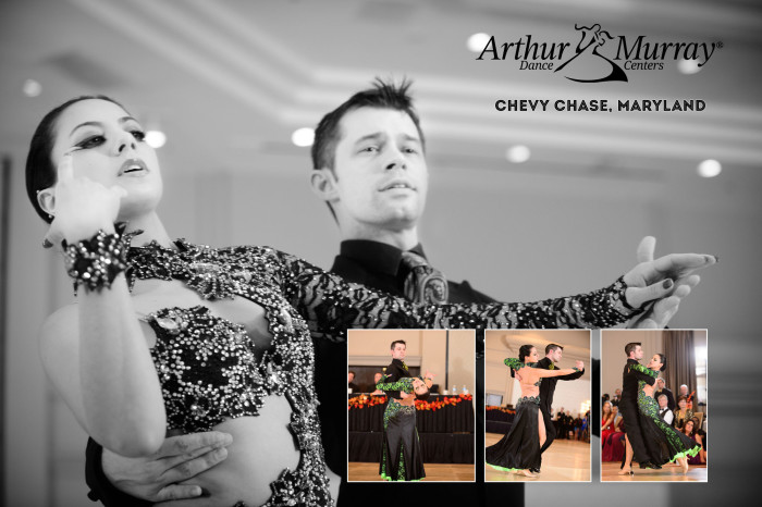
Arthur Murray - Chevy Chase, MD - ©TimeLine Media

The Adobe InDesign software is becoming a larger part of my photography as I learn more about the power of this program. The first time I used the program was with the CS5 suite as it was included with a package of programs from Adobe that included Photoshop, Illustrator and Lightroom. I did not think I would have any use for InDesign, but many photographers started to show videos on how they use InDesign for making album templates. It was then that it clicked!

Page Layout Design

Adobe InDesign CC Splash screen

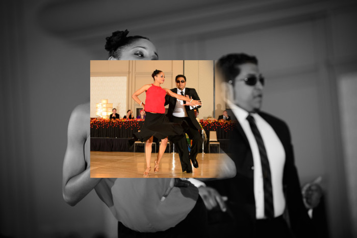
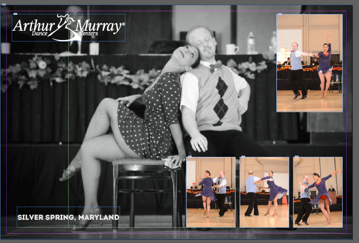
If keeping things perfectly centered, perfectly aligned with other elements, or perfectly aligned on a page, then this program is for you. It is amazingly useful for making album layouts. I use them for Ballroom Brag Books or wedding albums. Additionally it is really easy to make collages like I did recently for the TimeLine Media Facebook photo contest:

InDesign working layout - ©TimeLine Media
InDesign working layout – ©TimeLine Media

Frames are the basis for working in InDesign. You create the frame where you would like to place your element. These can be photos, text, illustration, or any other digital object. When adding text, you need to draw out the size of the box that you would like, then type. Afterwards, the text box acts like a text box in any other application. The powerful part of InDesign is that the frame can be moved anywhere on the image. Also, there are live guides (colored green) that will pop up when the text box is centered to another frame, or when the bottom of the frame will align with others. This has helped to lay elements out perfectly straight. Concurrently it will save you a lot of time if you are mixing images and text.

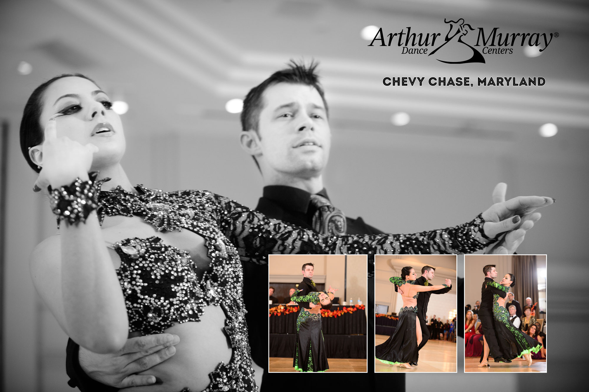
Speaking of which, I have a friendly photo contest going on at the TimeLine Media Facebook page. To help us decide which of the professional shows to feature at the upcoming Spring Freestyles, I have made posters from all the shows at the last Showcase. The 2 posters that received the most votes will be printed and displayed at the event. Please visit the page to vote for your favorites with a click of the “Like” button. Thank you!

Arthur Murray - Chevy Chase, MD - ©TimeLine Media
Arthur Murray – Chevy Chase, MD – ©TimeLine Media

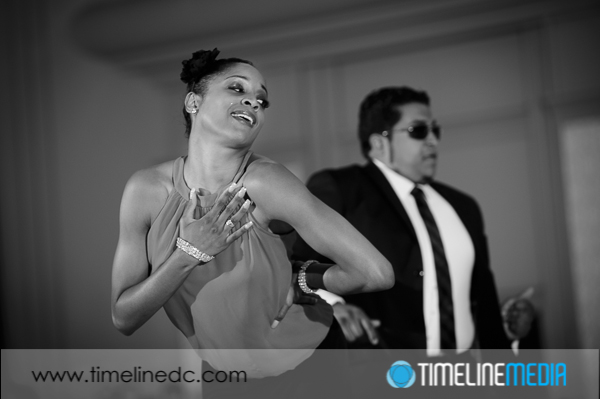
TimeLine Media – www.timelinedc.com
703-864-8208

Great Gatsby Gala – Tech Thursday

©TimeLine Media - poster base image

Time really flies! Today is the Great Gatsby Gala at the Arthur Murray – Tysons Corner, VA studio. A few months ago, I asked the staff if they would like to create a poster to advertise the theme of the party. This was back in the summer when the new Great Gatsby movie was still in theaters. In a few posts, I showed some of the steps that went into making the poster. One aspect that I used in the poster but did not blog about was the use of layers to place the portraits into one image.

Movie Poster

©TimeLine Media - Arthur Murray - Tysons Corner poster
©TimeLine Media – Arthur Murray – Tysons Corner poster

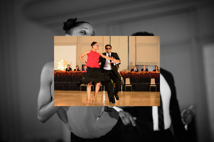
In the poster, the portraits were cut out very close to the edges of each person’s form. This will not work, though, for most action photos taken of dancers on the dance floor. If you have seen us at events, you probably have seen some posters that I have created with these shots, and I do them a little differently. In this example, I start with a large base image that I changed to black and white since it will be the background for the whole poster.

©TimeLine Media - poster base image
©TimeLine Media – poster base image

Next, I take another image, and overlay it right on top of this one. Automatically, Photoshop will put this on a new layer:

©TimeLine Media - poster in-process - 1
©TimeLine Media – poster in-process – 1

I then add a layer mask to this new layer. The default for the mask is to be completely white meaning the entire layer is in view. Then, I select the layer mask, and choose a black brush with hardness turned down to 0%, and brush black onto the layer mask which removes the edges from the color image:

©TimeLine Media - poster in-process - 2
©TimeLine Media – poster in-process – 2

Here is a look at the final layer toolbar when all the images, layer masks, and edits are added:

Photoshop Layers Toolbar

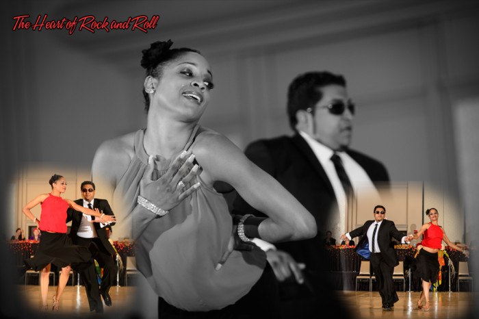
And finally, here is the example poster created with these edits. It contains 3 images from this show, 2 layer masks that blend the color images over the monochrome background image, and some text with the song name. It is a different way to combine multiple images into one setting. The result is a little more organic or free-flowing compared to hard edges. Both will work!

©TimeLine Media - Heart Of Rock and Roll
©TimeLine Media – Heart Of Rock and Roll

TimeLine Media – www.timelinedc.com
703-864-8208

Great Gatsby Poster Part 2 – Tech Thursday

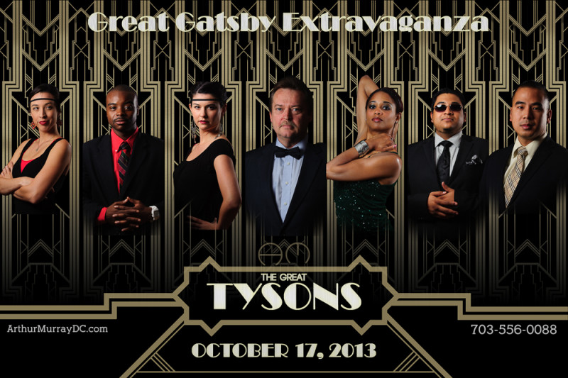
©TimeLine Media - Arthur Murray - Tysons Corner poster

Poster Creation

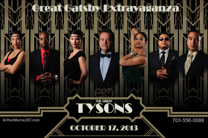
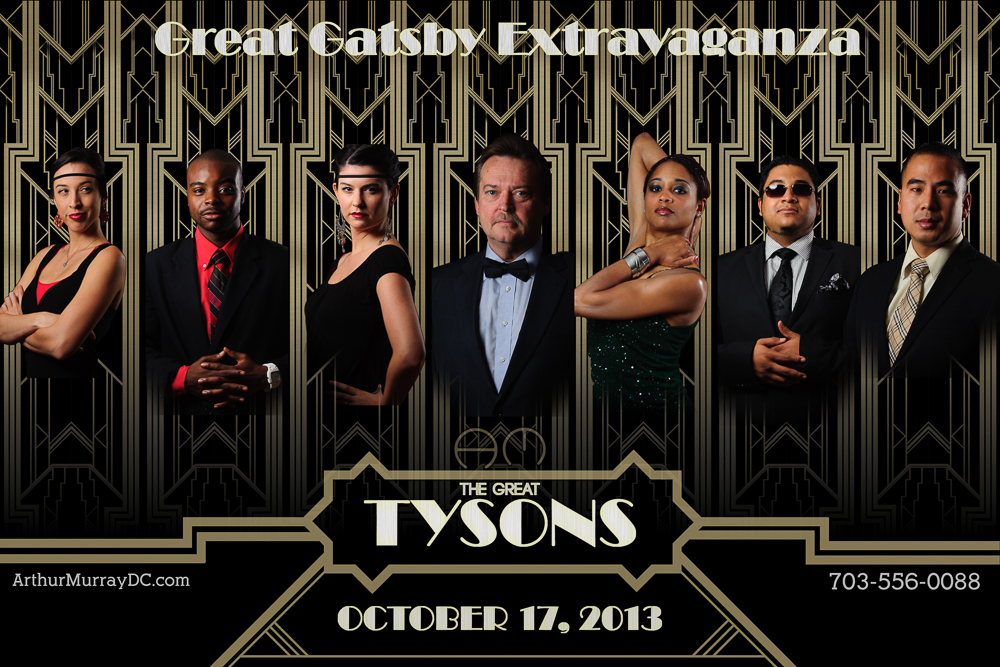
The last Tech Thursday, I posted about the Great Gatsby poster from the 2013 movie. I made myself a project to recreate the poster with our local dance studio since they are planning a party with a Great Gatsby theme this October. To start, I made portraits of all the staff, then made a background in Adobe Illustrator to place them. It was a background that was flipped and repeated so that it would give a consistent look to each of the portraits.

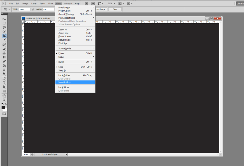
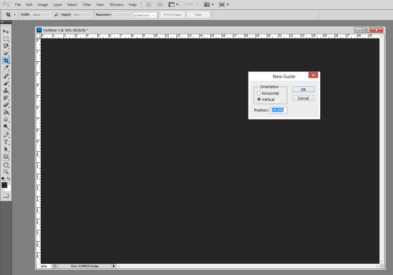
To come up with the dimensions for the backgrounds, I based it on a 20 x 30 image. This is a standard size for printing and framing of photos, and would be large enough to put 7 portraits on at one time. In Adobe Photoshop, you can create guides to help you line up elements in your image. So I started with a 20 x 30 image, then made guides all 14.3% apart from each other. This value comes from dividing 100 by 7, which is 14.28… Rounded to 14.3 would fill up the background close to 100% across – 100.1%, actually. Here are screen shots of how to do this:

New Guide option from the menu in Photoshop CS5

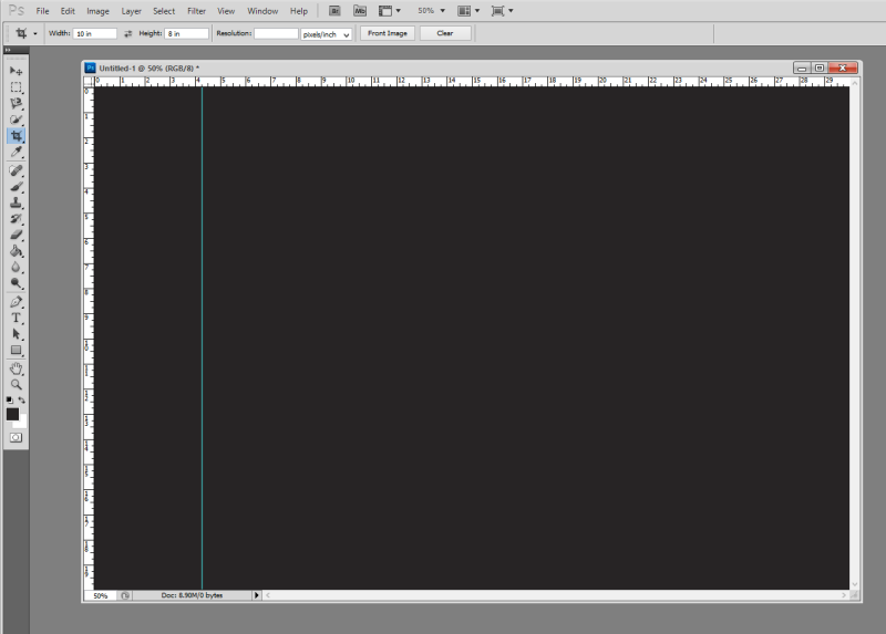
Select ‘View’ > ‘New Guide’ to create a guide on your image. The default units in this box are in inches, so change from in to %, and the guide will be placed 14.3% across the image vertically from the left.

Background Graphic Design

New guide at 14.3% of the background vertically

From here, I just selected the are to the left of the guide to get the dimensions to bring into Illustrator to create the background. Similarly, I made guides in Illustrator that divided the rectangle into quarters. I created the design in one corner, then flipped and moved the design until it filled up the entire area making the design nicely symmtrical:

©TimeLine Media - portrait background
©TimeLine Media – portrait background

I burned some of the smaller lines to make it look like they were continuing on under the larger lines. I also made a dark gradient towards the bottom of the frame to add more dimension to the background. Then I pasted the portraits on top of the background, and added them to the complete poster in my evenly spaced guides. This did take me about a day and a half to complete since I was learning a lot of new techniques in Adobe programs, but I think it came out nicely!

©TimeLine Media - Arthur Murray - Tysons Corner poster
©TimeLine Media – Arthur Murray – Tysons Corner poster

TimeLine Media – www.timelinedc.com
703-864-8208
1 2 3